
Milkaut
Branding & Identity.
Motion Graphics.
Packaging Design.
Client
Savencia Argentina
Service
Branding & Identity.
Motion Graphics.
Packaging Design.
Year
2019
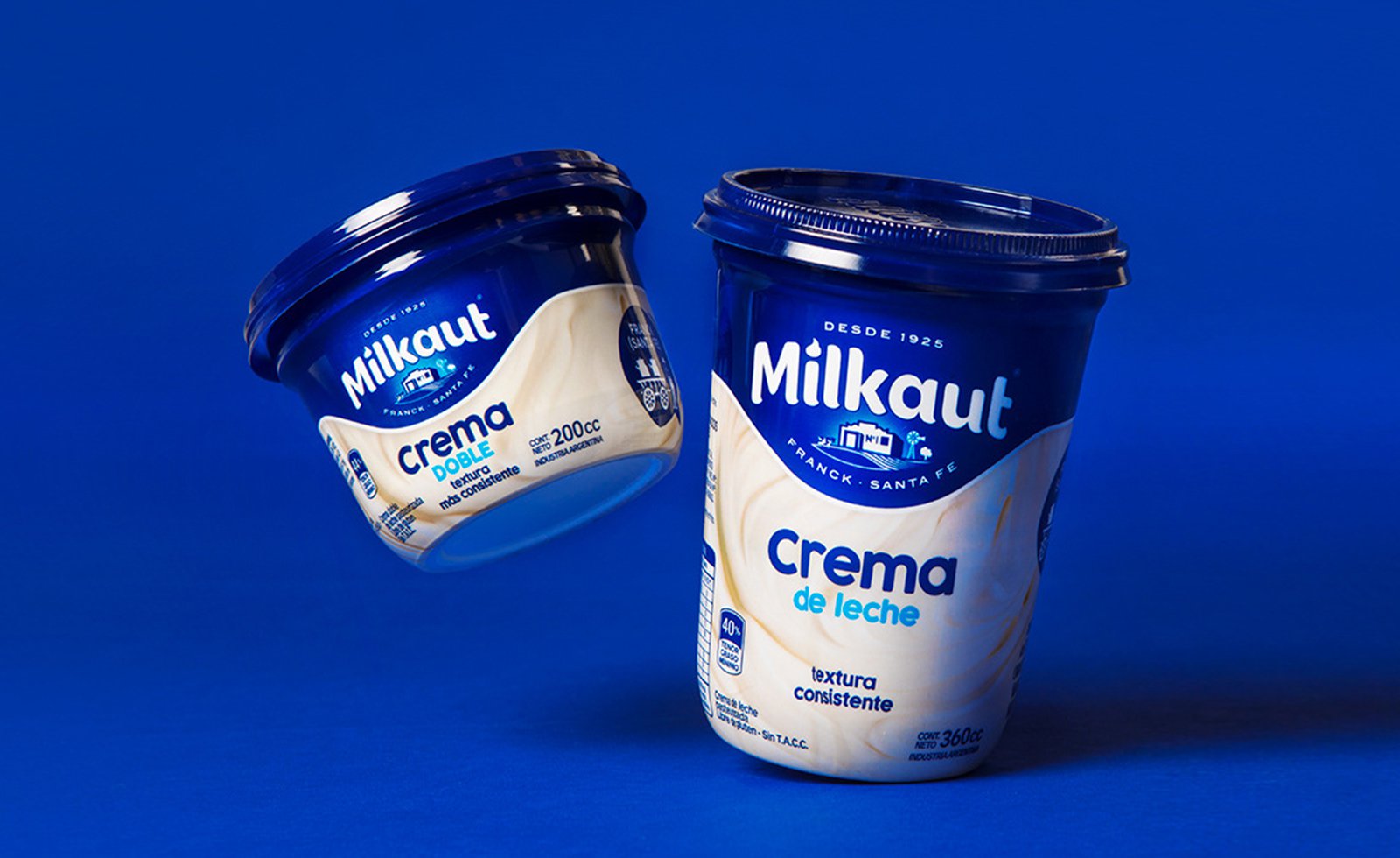
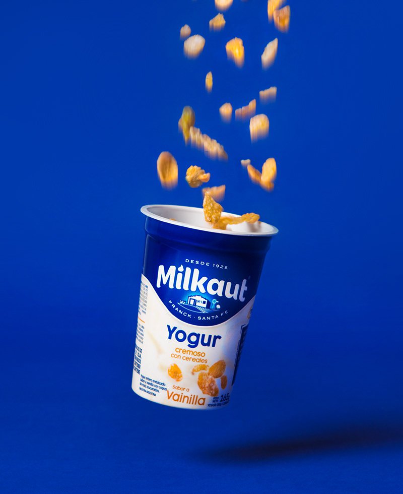
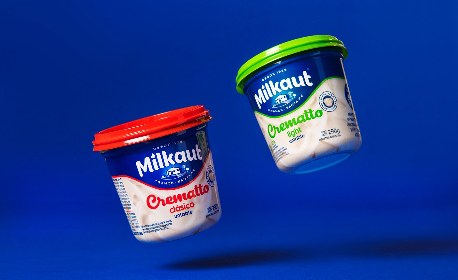
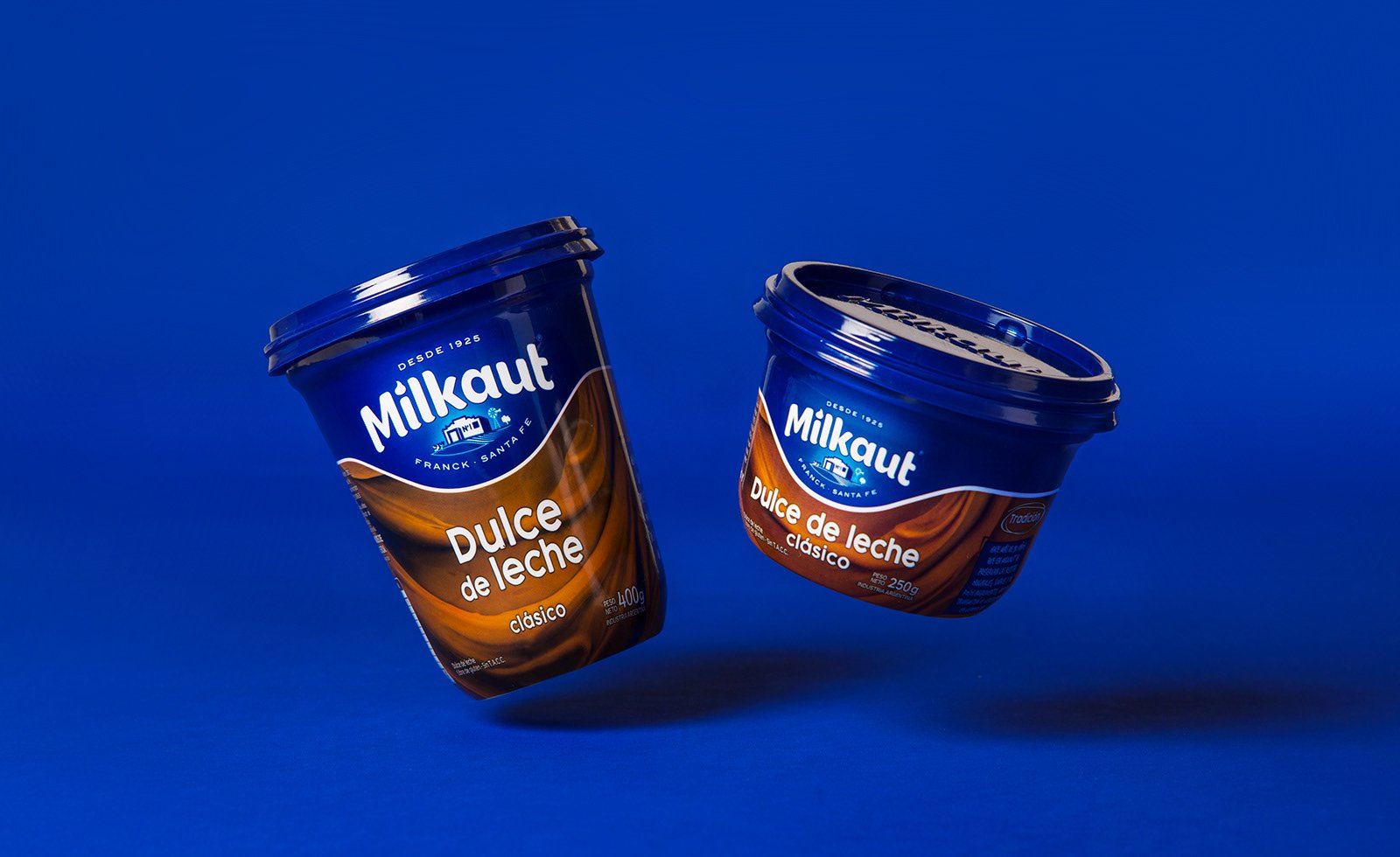
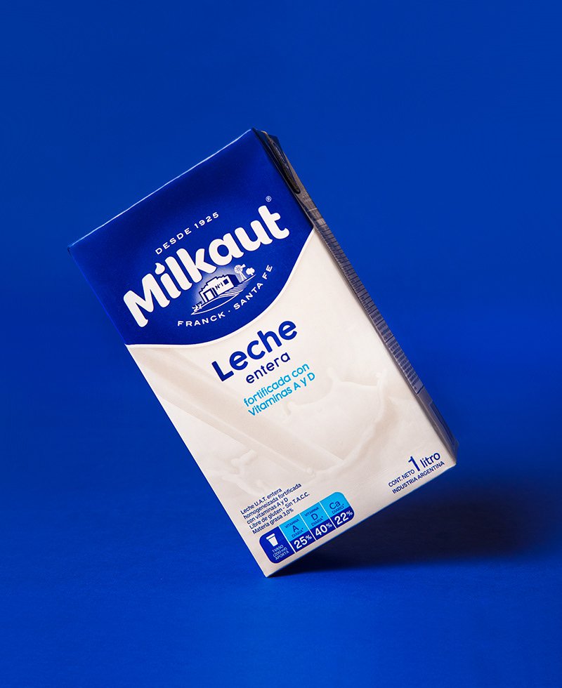
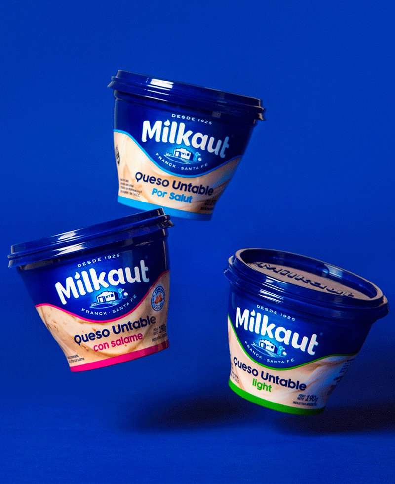
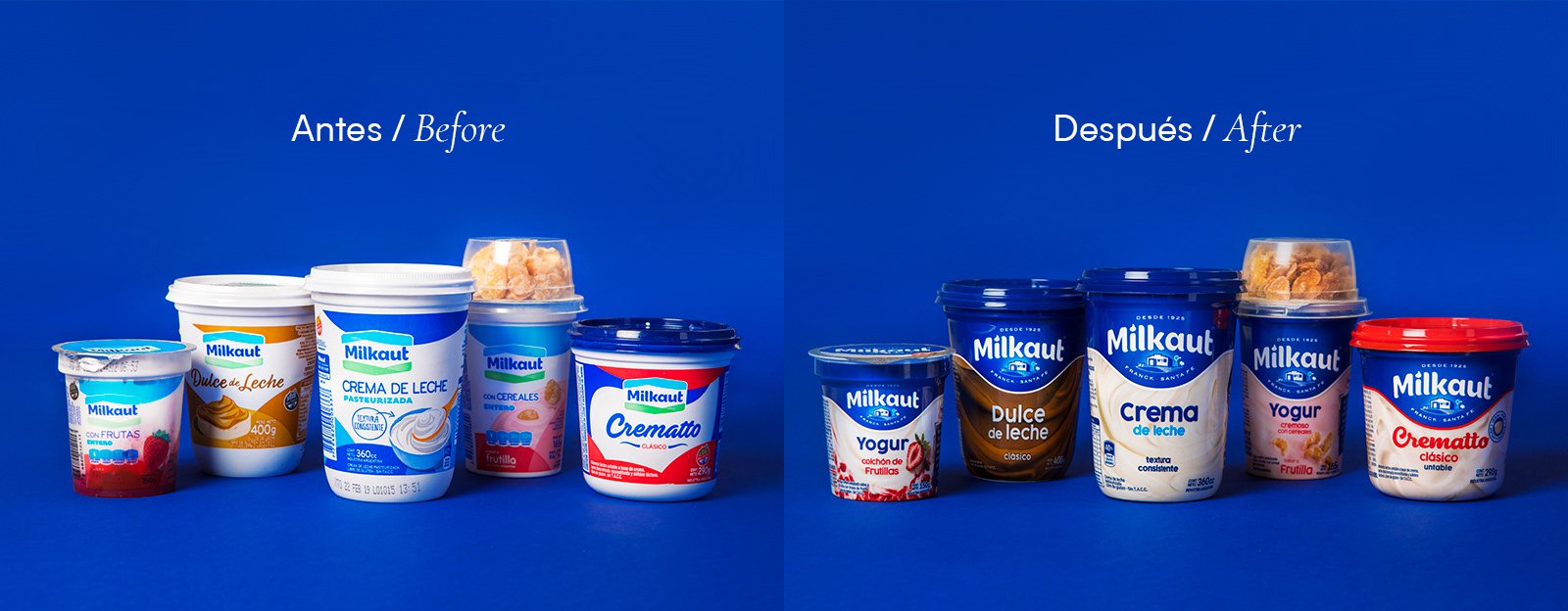
Background How could a dairy company, founded in 1926 by a group of twenty-nine dairy producers from the province of Santa Fe, differentiate itself from the giants of the competition? How to develop a value proposition that generates impact, adds mystique to the brand, without losing focus on the quality of its products? How to create an identity, a genuine brand personality, capable of delivering results while being both authentic and unique? Idea We had to focus on the human aspect. MILKAUT needed to make a leap in quality, and the focus was on the people who supported the brand: most of the residents of Franck, in Santa Fe, are or were employees of MILKAUT. They are the ones who support and build the brand daily, based on their values of quality, flavor, and dedication. We translated, in design terms, what we received from so many people, to achieve, together, a genuine, authentic brand, and consequently, unique and unrepeatable. Development We developed a new visual identity that stood out on the packaging for showcasing the front of the old creamery, the first in Argentina and one of the most important historical landmarks of Franck. We added four fundamental elements: a cow, a fragment of plowed land, a mill, and the silhouette of an ombú tree. All these elements are part of the natural landscape of Franck. Result The work transcended the boundaries of the business: the employees of Franck were moved during the presentation of the new visual identity, which awakened pride among all the villagers. In the strategic segments of cream, dulce de leche, yogurts, spreads, and crematto, the brand experienced a 21% growth during the first three months in the market, compared to the same quarter of the previous year. The growth of dulce de leche during this same period was 40%. We applied the brand over a deep blue that had been part of its initial packaging and conveyed the new momentum of the brand, in addition to its sincere and family-oriented personality.
Background How could a dairy company, founded in 1926 by a group of twenty-nine dairy producers from the province of Santa Fe, differentiate itself from the giants of the competition? How to develop a value proposition that generates impact, adds mystique to the brand, without losing focus on the quality of its products? How to create an identity, a genuine brand personality, capable of delivering results while being both authentic and unique? Idea We had to focus on the human aspect. MILKAUT needed to make a leap in quality, and the focus was on the people who supported the brand: most of the residents of Franck, in Santa Fe, are or were employees of MILKAUT. They are the ones who support and build the brand daily, based on their values of quality, flavor, and dedication. We translated, in design terms, what we received from so many people, to achieve, together, a genuine, authentic brand, and consequently, unique and unrepeatable. Development We developed a new visual identity that stood out on the packaging for showcasing the front of the old creamery, the first in Argentina and one of the most important historical landmarks of Franck. We added four fundamental elements: a cow, a fragment of plowed land, a mill, and the silhouette of an ombú tree. All these elements are part of the natural landscape of Franck. Result The work transcended the boundaries of the business: the employees of Franck were moved during the presentation of the new visual identity, which awakened pride among all the villagers. In the strategic segments of cream, dulce de leche, yogurts, spreads, and crematto, the brand experienced a 21% growth during the first three months in the market, compared to the same quarter of the previous year. The growth of dulce de leche during this same period was 40%. We applied the brand over a deep blue that had been part of its initial packaging and conveyed the new momentum of the brand, in addition to its sincere and family-oriented personality.


We translated, in design terms, what we had received from so many people, to achieve, together, a genuine, authentic brand, and consequently, unique and unrepeatable.


We applied the brand to a deep blue that was part of its early packaging and conveyed the brand's new momentum, as well as its sincere and family-oriented personality.


The work transcended the boundaries of business: Franck's employees were moved at the presentation of the new visual identity, which awakened the pride of all the town's residents.


Contact us
" height="24px" id="Y_SogtFLR" width="23.998702773987908px"/></svg>)
" height="23.91171428571431px" id="eAEKng1cA" width="24px"/></svg>)
" height="24px" id="bloY09y18" width="24px"/></svg>)
" height="15.080483675527217px" id="P2vInqImQ" transform="translate(0 4)" width="23.999999787140037px"/></svg>)
Buenos Aires
Headquarters
Gonzalo Berro
gberro@grupoberro.com
+54 911 4579 5555
Laura García
lgarcia@grupoberro.com
+54 911 6542 4090
Spain
8 Ventura Rodríguez, Portal 6 1A, Boadilla del Monte 28660, Madrid
+34 679 184165
UNITED STATES
9545 Harding Av. Surfside, Florida, FL 33154
2005-2026 @ Berro Group
Contact us
Buenos Aires
Headquarters