Sibarita
Packaging Design.
Sibarita
Packaging Design.
Client
Molinos Río de la Plata
Service
Packaging Design.
Year
2026
Sibarita
Bringing Back Desire Without Losing Recognition
Background
Sibarita is one of Argentina’s best-known frozen pizza brands. It has more than twenty years of history and became famous for an advertising campaign built around a question that many people still remember today: “¿Por qué Sibarita es tan rica?” — “Why is Sibarita so delicious?”
The brand still enjoyed strong recognition, but its packaging had lost relevance. It no longer communicated something simple yet essential to the category: the desire to enjoy a delicious, generous pizza straight from the oven.
The Challenge
The first thing we understood was that Sibarita did not need to become a different brand. Its name, its signature red color and its historic tagline still held great value.
The challenge was to update its expression without losing everything people already knew and recognized. To make it feel more contemporary and appealing while keeping its identity intact.
The Project
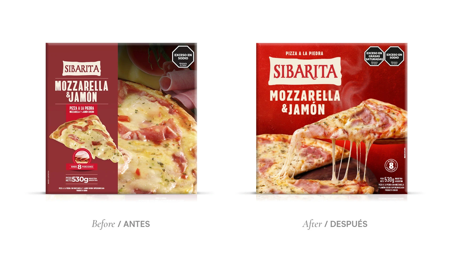
We refined a few details of the logo to improve its presence and legibility without changing its essence.
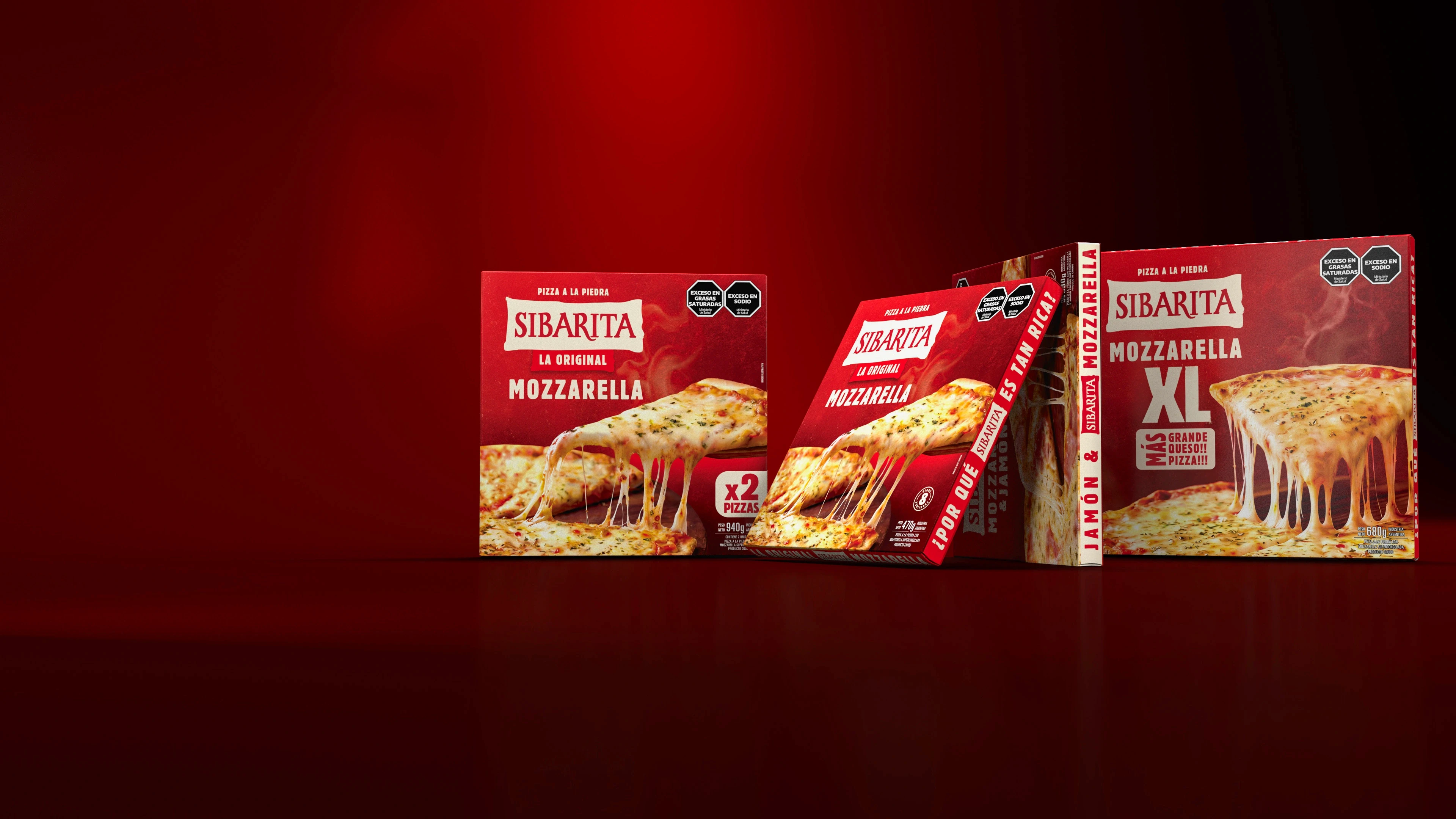
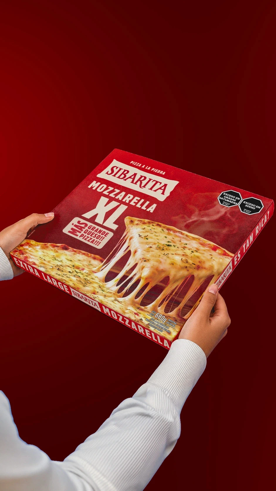
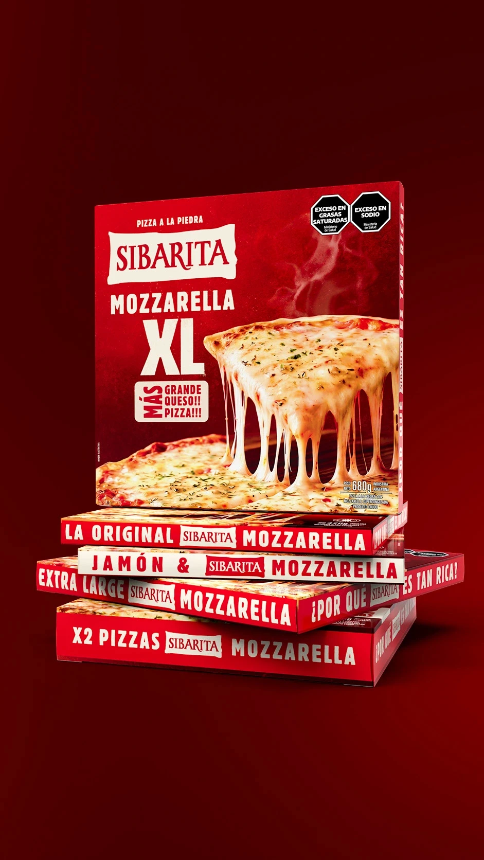
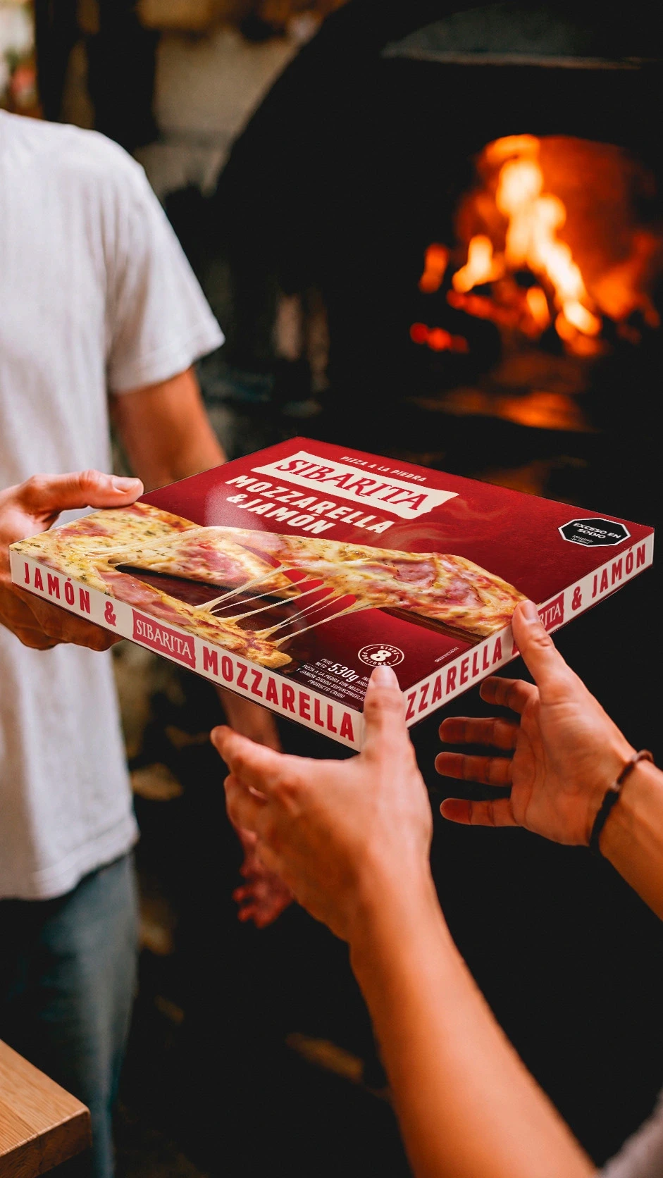
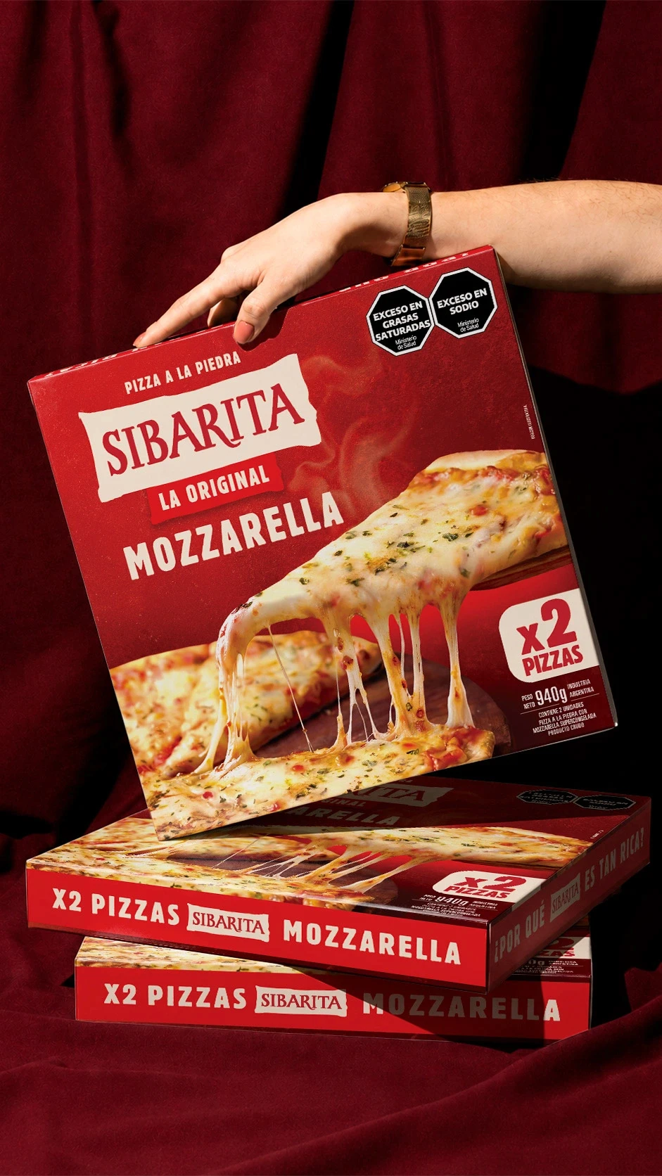
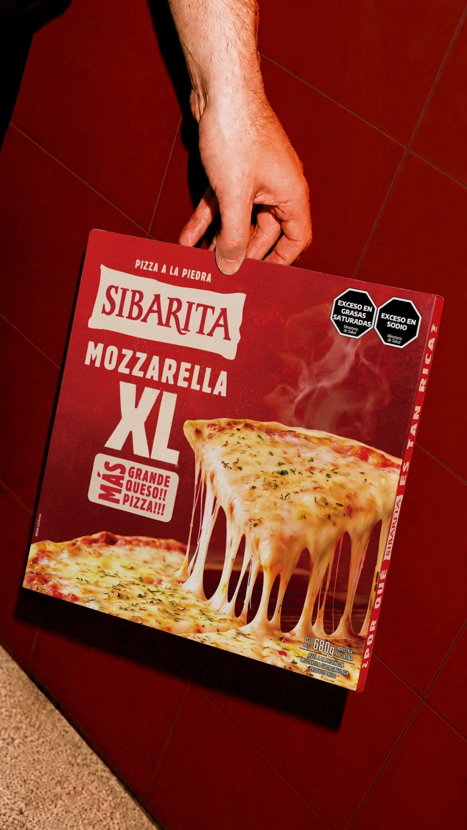
Our main focus was the product itself. We took advantage of the large box format to show the pizza in a much closer and more tempting way. Melted cheese, a lifted slice and the feeling of a freshly served pizza became the center of the design.
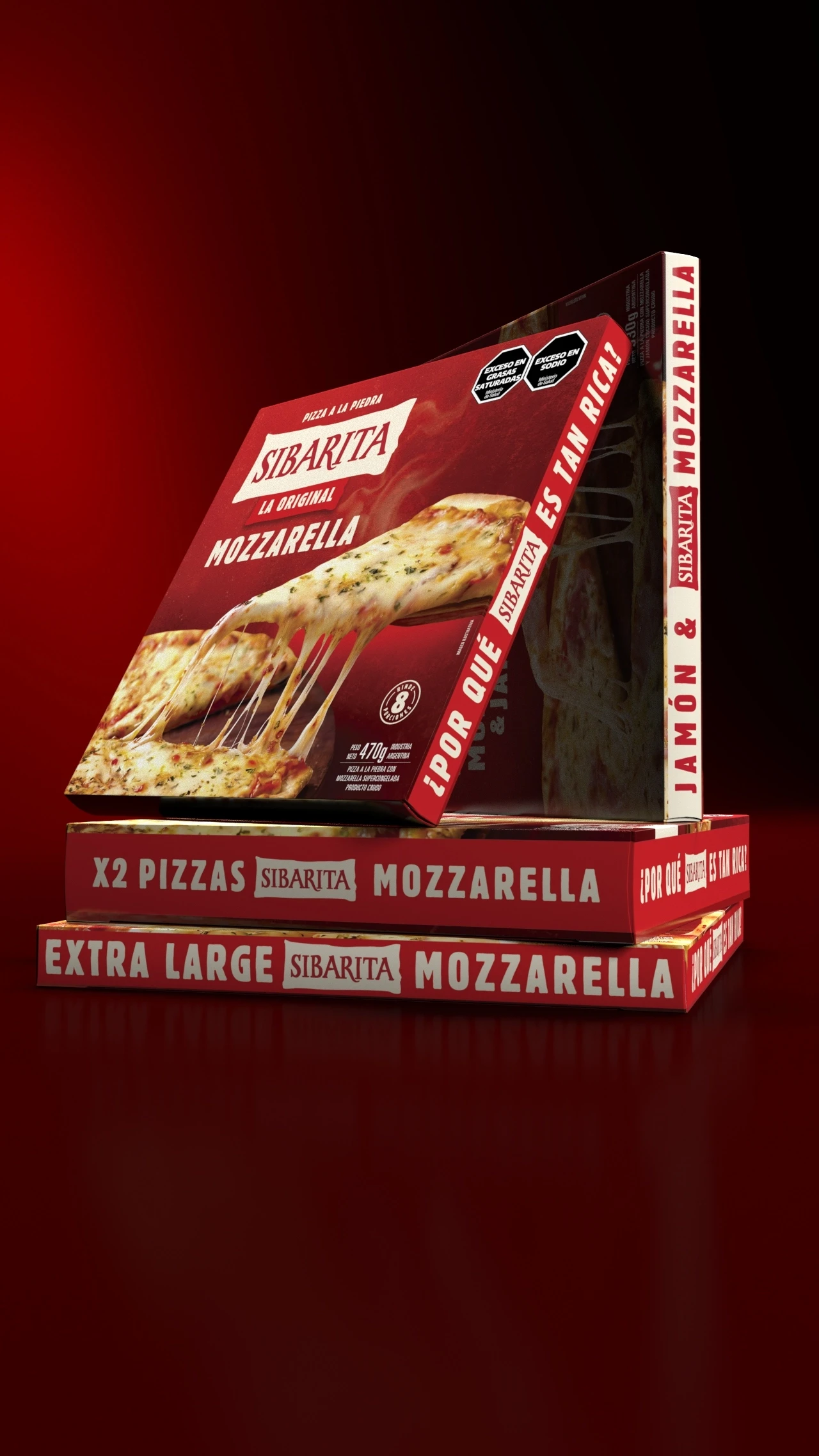
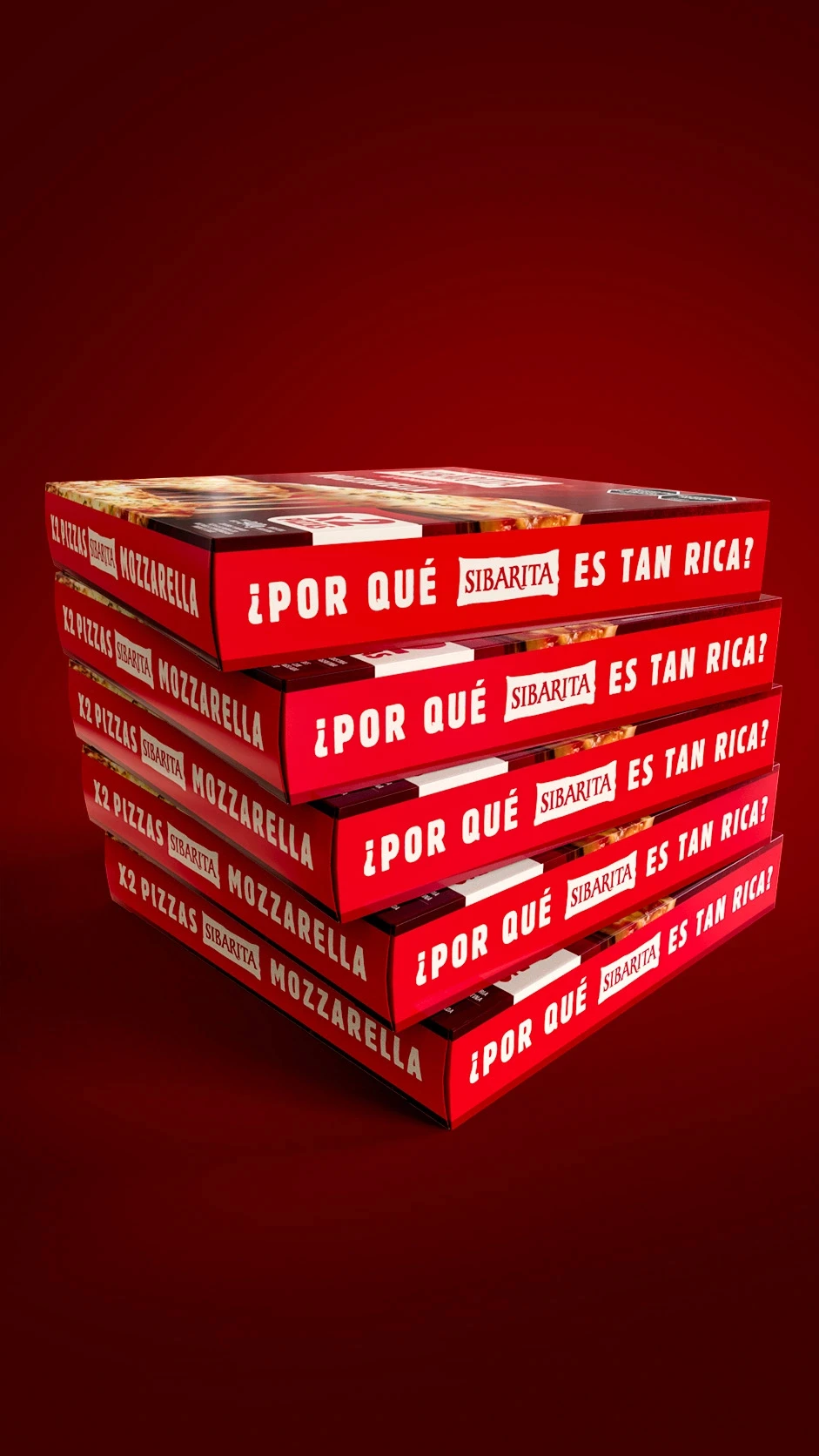
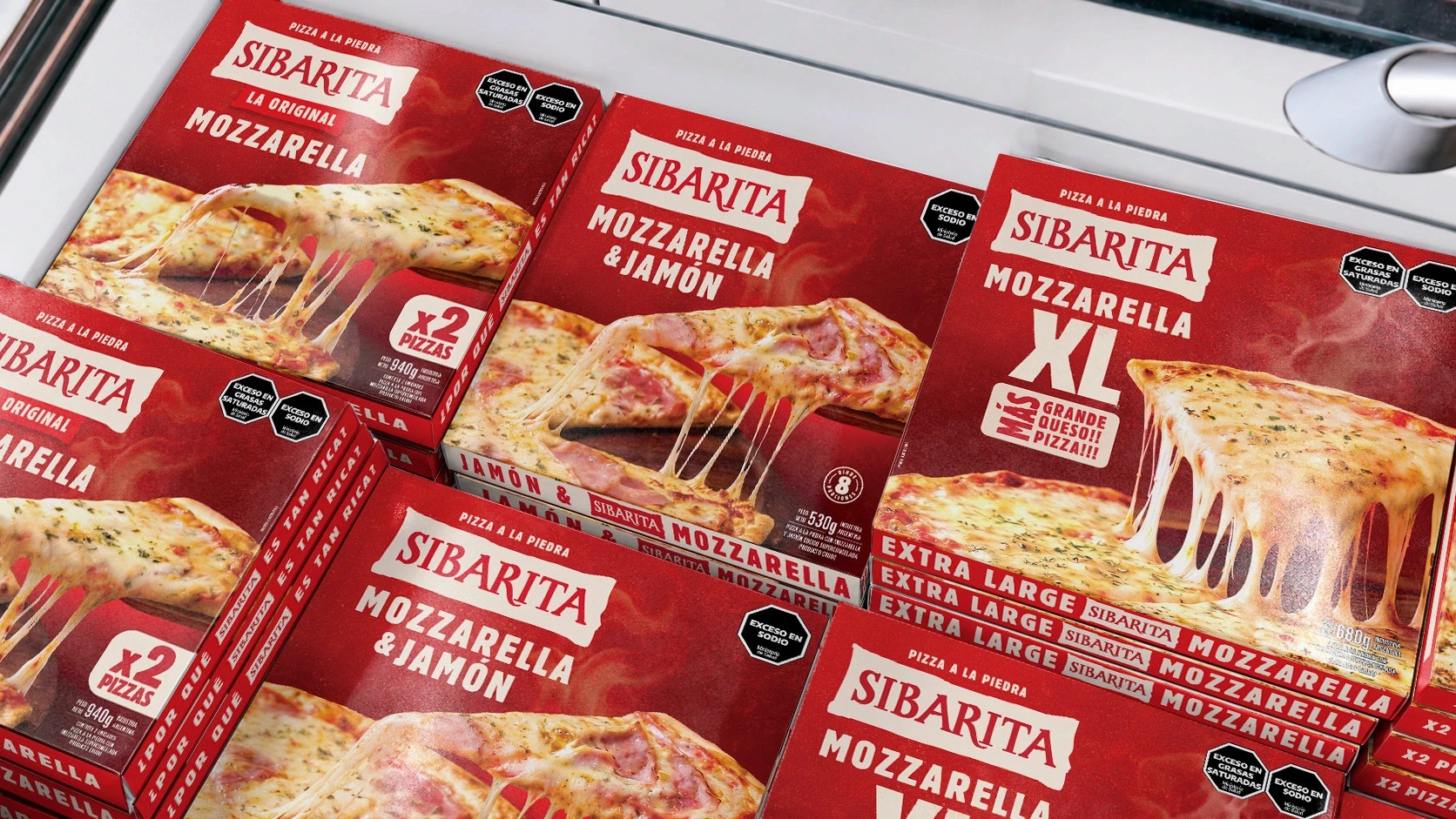
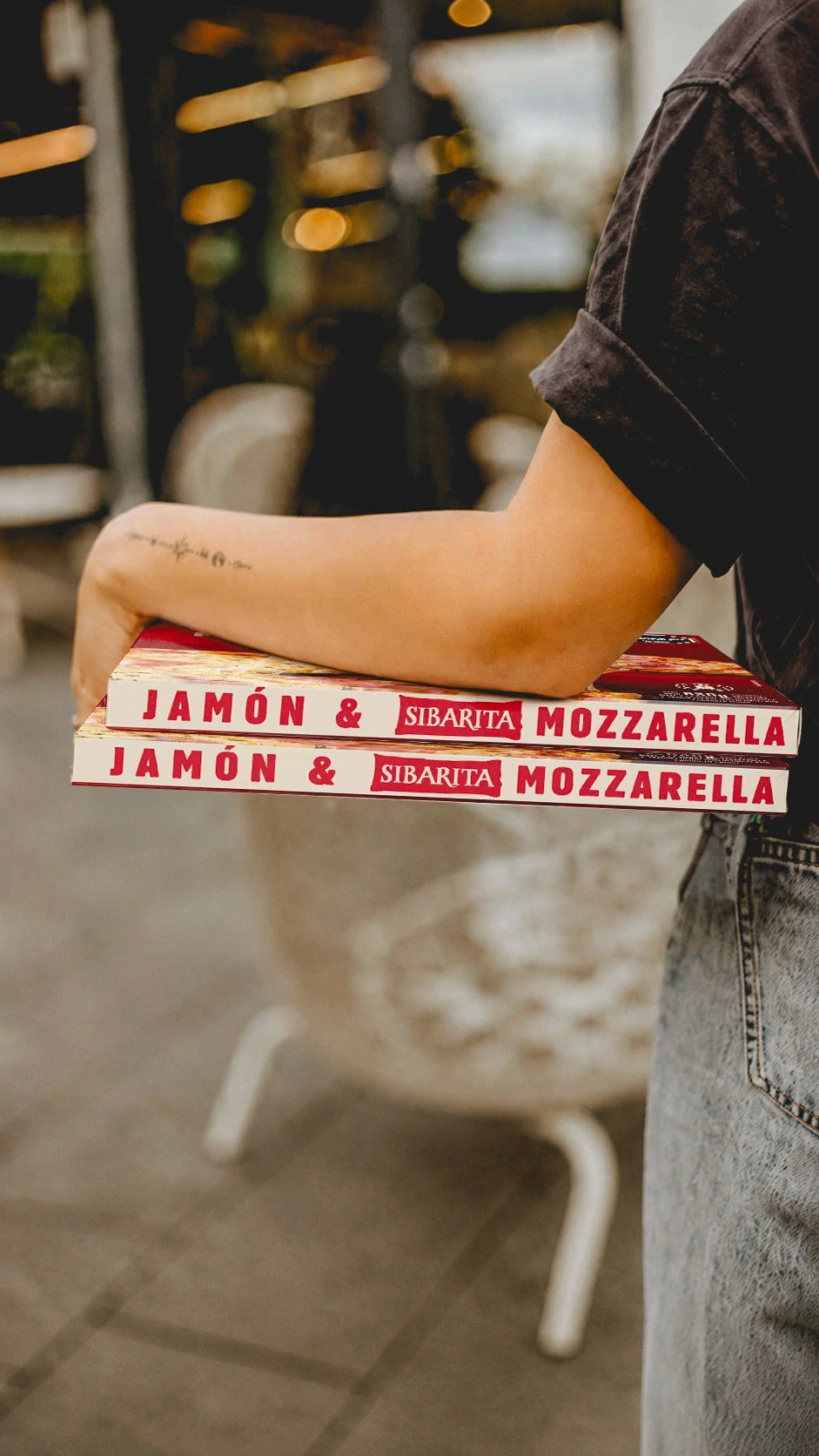
We also paid special attention to the side panels, as frozen pizza boxes are often displayed in stacks, making the side of the pack the first thing consumers actually see.
We used large, bold typography to identify each flavor and incorporated the phrase “¿Por qué Sibarita es tan rica?” as part of the system. This allows both the brand and each variety to be quickly recognized, even when the boxes are stacked.
The Result
The new packaging brings back the strength and appeal Sibarita needed at the point of sale. The pizza is once again the hero, and the brand now feels more current, clear and tempting.
We did not want to create a different Sibarita. We wanted to bring forward everything that was already great about the brand.
Sibarita
Bringing Back Desire Without Losing Recognition
Background
Sibarita is one of Argentina’s best-known frozen pizza brands. It has more than twenty years of history and became famous for an advertising campaign built around a question that many people still remember today: “¿Por qué Sibarita es tan rica?” — “Why is Sibarita so delicious?”
The brand still enjoyed strong recognition, but its packaging had lost relevance. It no longer communicated something simple yet essential to the category: the desire to enjoy a delicious, generous pizza straight from the oven.
The Challenge
The first thing we understood was that Sibarita did not need to become a different brand. Its name, its signature red color and its historic tagline still held great value.
The challenge was to update its expression without losing everything people already knew and recognized. To make it feel more contemporary and appealing while keeping its identity intact.
The Project
We refined a few details of the logo to improve its presence and legibility without changing its essence.
Our main focus was the product itself. We took advantage of the large box format to show the pizza in a much closer and more tempting way. Melted cheese, a lifted slice and the feeling of a freshly served pizza became the center of the design.
We also paid special attention to the side panels, as frozen pizza boxes are often displayed in stacks, making the side of the pack the first thing consumers actually see.
We used large, bold typography to identify each flavor and incorporated the phrase “¿Por qué Sibarita es tan rica?” as part of the system. This allows both the brand and each variety to be quickly recognized, even when the boxes are stacked.
The Result
The new packaging brings back the strength and appeal Sibarita needed at the point of sale. The pizza is once again the hero, and the brand now feels more current, clear and tempting.
We did not want to create a different Sibarita. We wanted to bring forward everything that was already great about the brand.
The challenge was to update its expression without losing everything people already knew and recognized.
Contact us
" height="24px" id="Y_SogtFLR" width="23.998702773987908px"/></svg>)
" height="23.91171428571431px" id="eAEKng1cA" width="24px"/></svg>)
" height="24px" id="bloY09y18" width="24px"/></svg>)
" height="15.080483675527217px" id="P2vInqImQ" transform="translate(0 4)" width="23.999999787140037px"/></svg>)
Buenos Aires
Headquarters
Gonzalo Berro
gberro@grupoberro.com
+54 911 4579 5555
Laura García
lgarcia@grupoberro.com
+54 911 6542 4090
2005-2026 @ Berro Group
Contact us
Buenos Aires
Headquarters
Gonzalo Berro
gberro@grupoberro.com
+54 911 4579 5555
Laura García
lgarcia@grupoberro.com
+54 911 6542 4090
2005-2026 @ Berro Group
Contact us
Buenos Aires
Headquarters