
Gallo Snacks
Branding & Identity.
Packaging Design.
Gallo Snacks
Branding & Identity.
Packaging Design.
Client
Molinos Río de la Plata
Service
Branding & Identity.
Packaging Design.
Year
2026
Gallo Snacks
How We Built a Brand That Created a Category
Background
In 2012, very few people imagined that rice could become a snack.
The category was virtually nonexistent, and the challenge was considerable: transforming a product historically associated with traditional meals into a delicious, modern, and healthy option that could be enjoyed at any time of day.
Molinos Río de la Plata entrusted Grupo Berro with developing the identity for this new venture. The goal was not simply to design packaging, but to build a brand capable of creating an entirely new category.
That is how Gallo Snacks was born.
Nearly fifteen years later, that vision has become a resounding success. Today, Gallo Snacks is a leading name in healthy snacks in Argentina, with a presence in convenience stores, supermarkets, and retail outlets throughout the country. Grupo Berro has continued to support the brand’s evolution from day one.
The Project
From the initial launch, we worked closely with the client to build a strong, flexible brand architecture designed for growth.
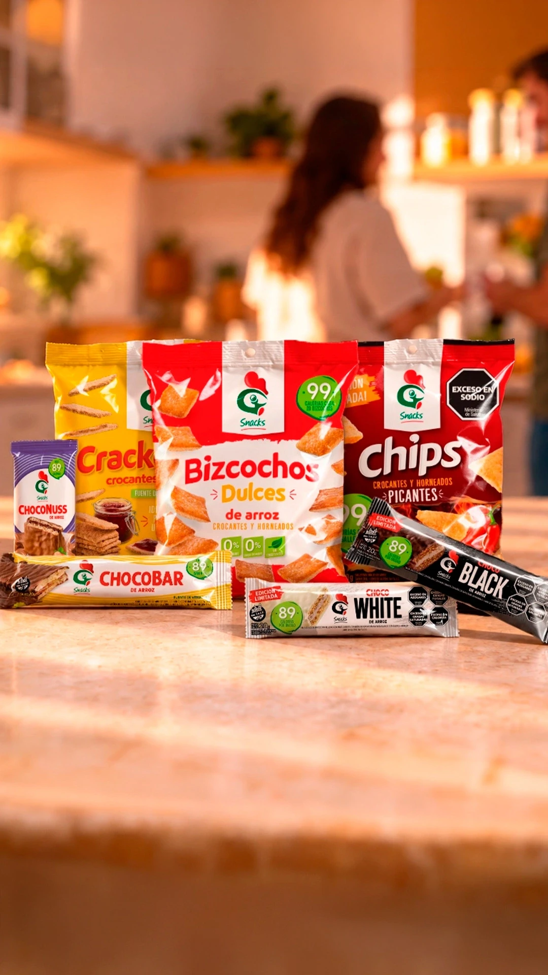
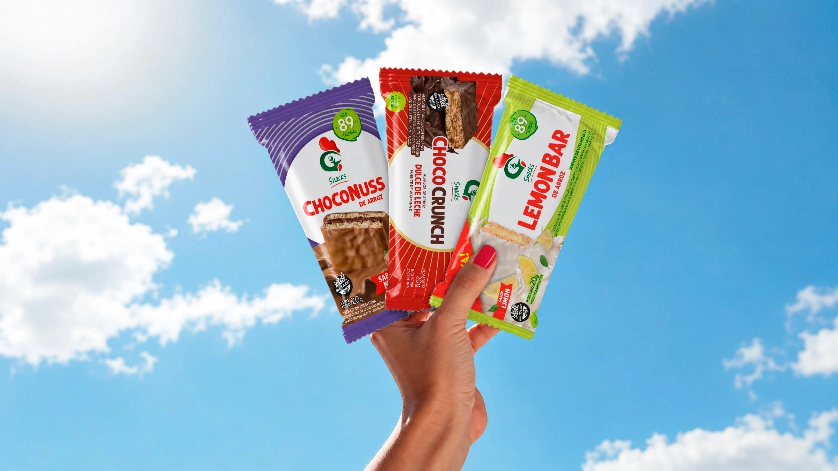
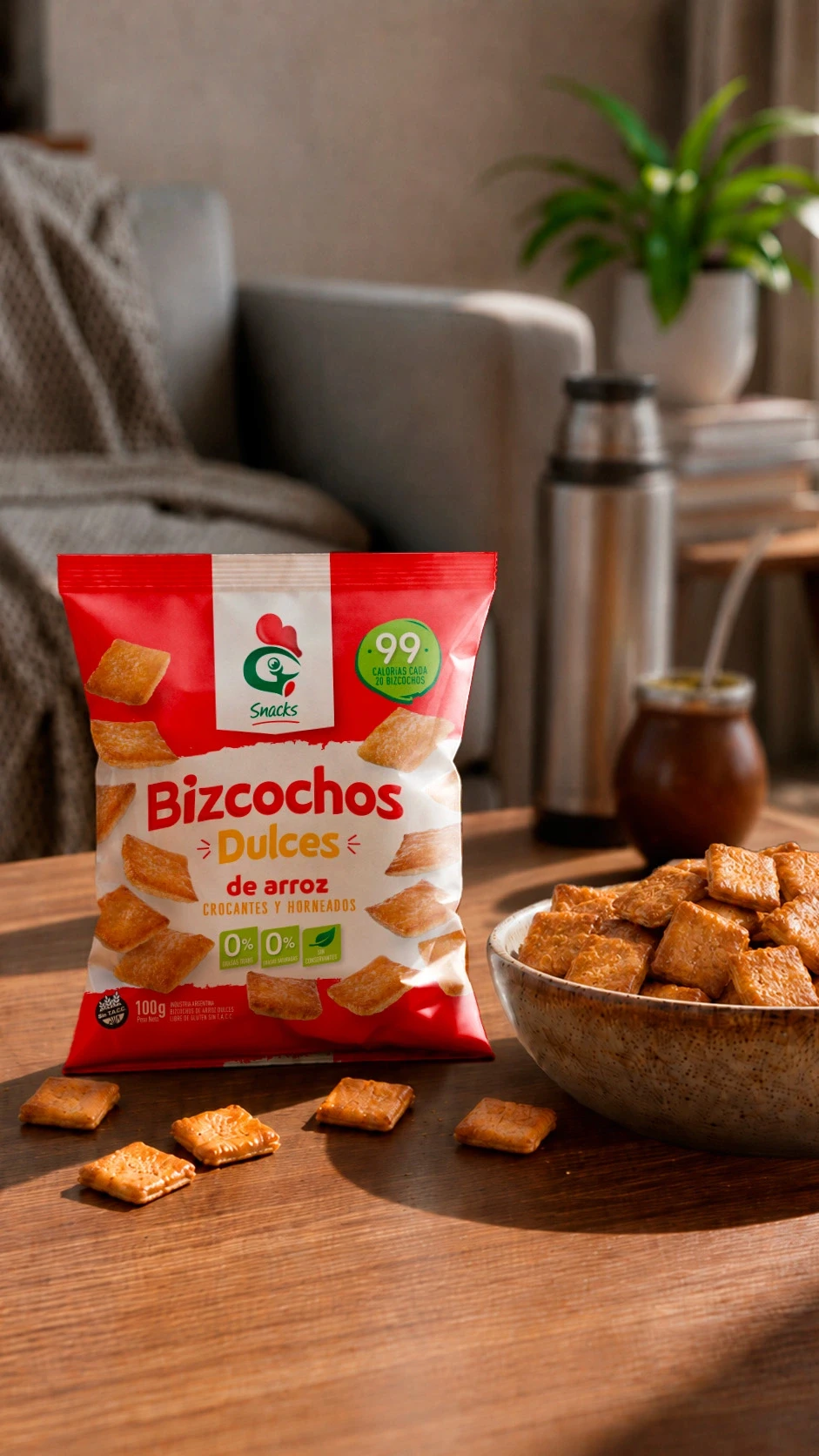
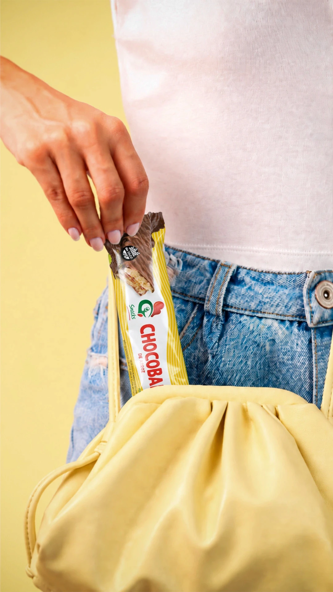
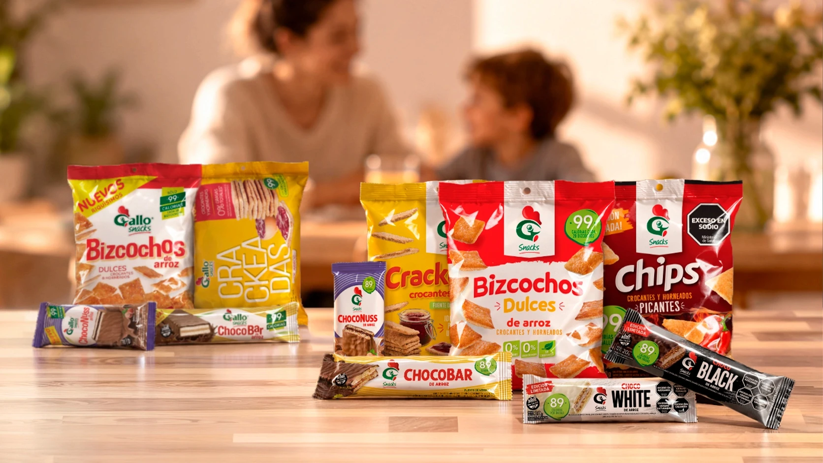
Over the years, we developed the branding, packaging design, and identity for an extensive family of products, continually adding new offerings such as wafers, cookies, chips, crackers, bars, popcorn, and a variety of special editions.
Each launch presented a new challenge: creating products with their own distinctive personalities while maintaining the consistency of a brand that needed to be instantly recognizable. This balance between innovation and consistency became the foundation upon which the entire Gallo Snacks portfolio was built.
The brand identity evolved as well.
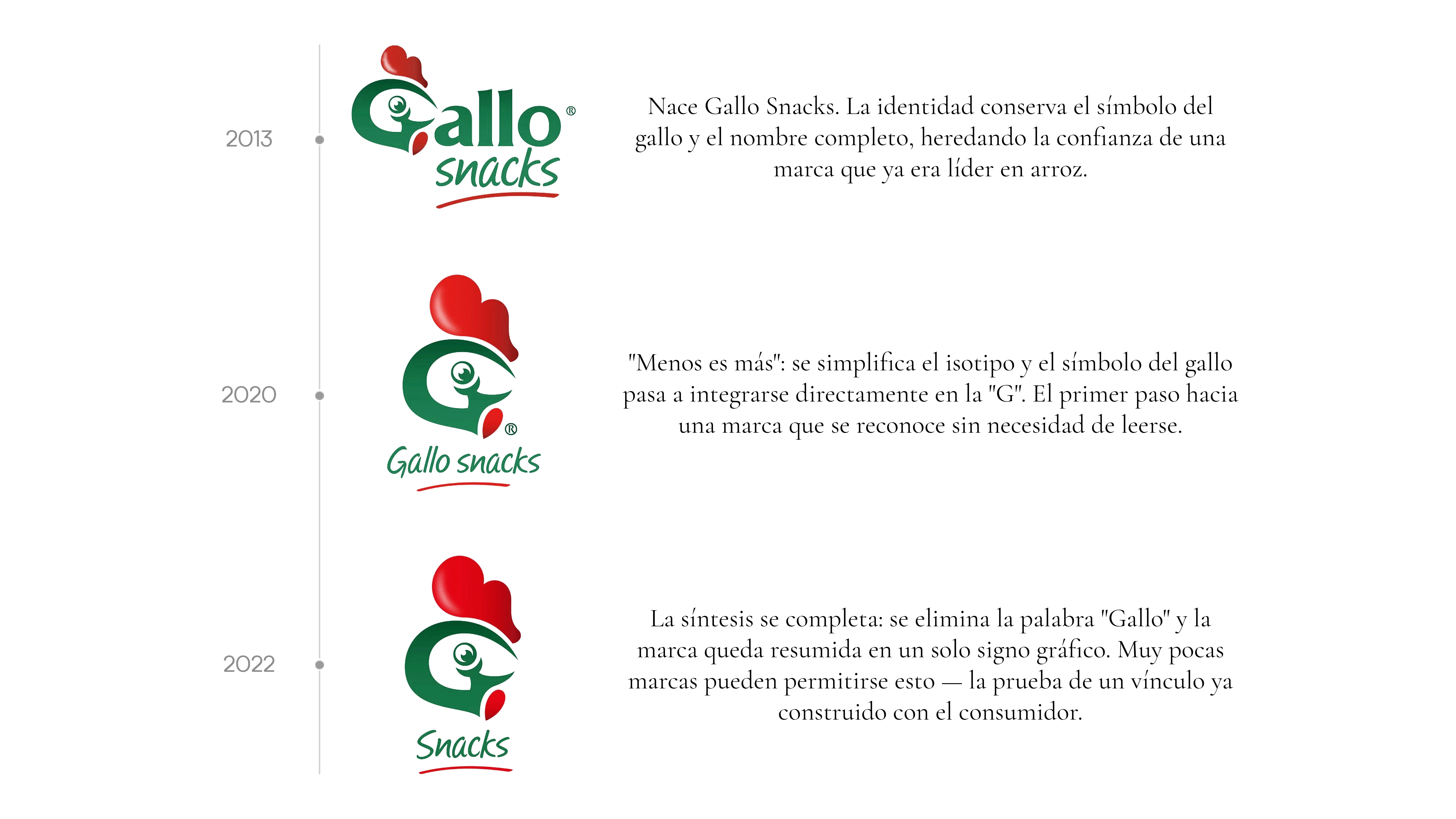
As the brand grew, we realized that the recognition achieved by the historic rooster symbol allowed us to take the identity one step further. Applying the principle that “less is more,” we proposed simplifying the brand by removing the word “Gallo” and retaining only the “G” together with its iconic symbol.
Very few brands can reduce their identity to a single graphic sign. This synthesis reflected a brand that had already built a powerful connection with consumers.
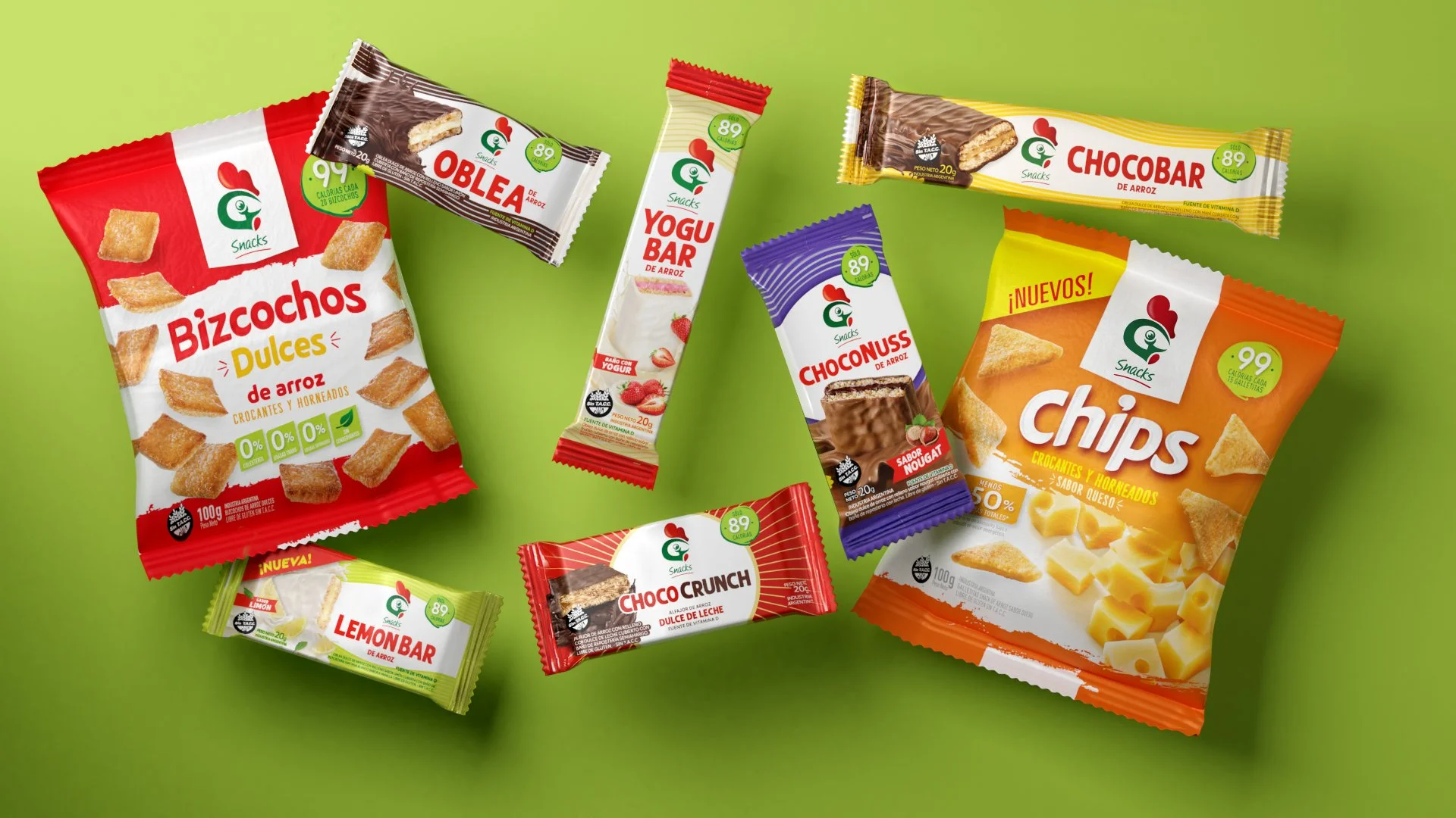
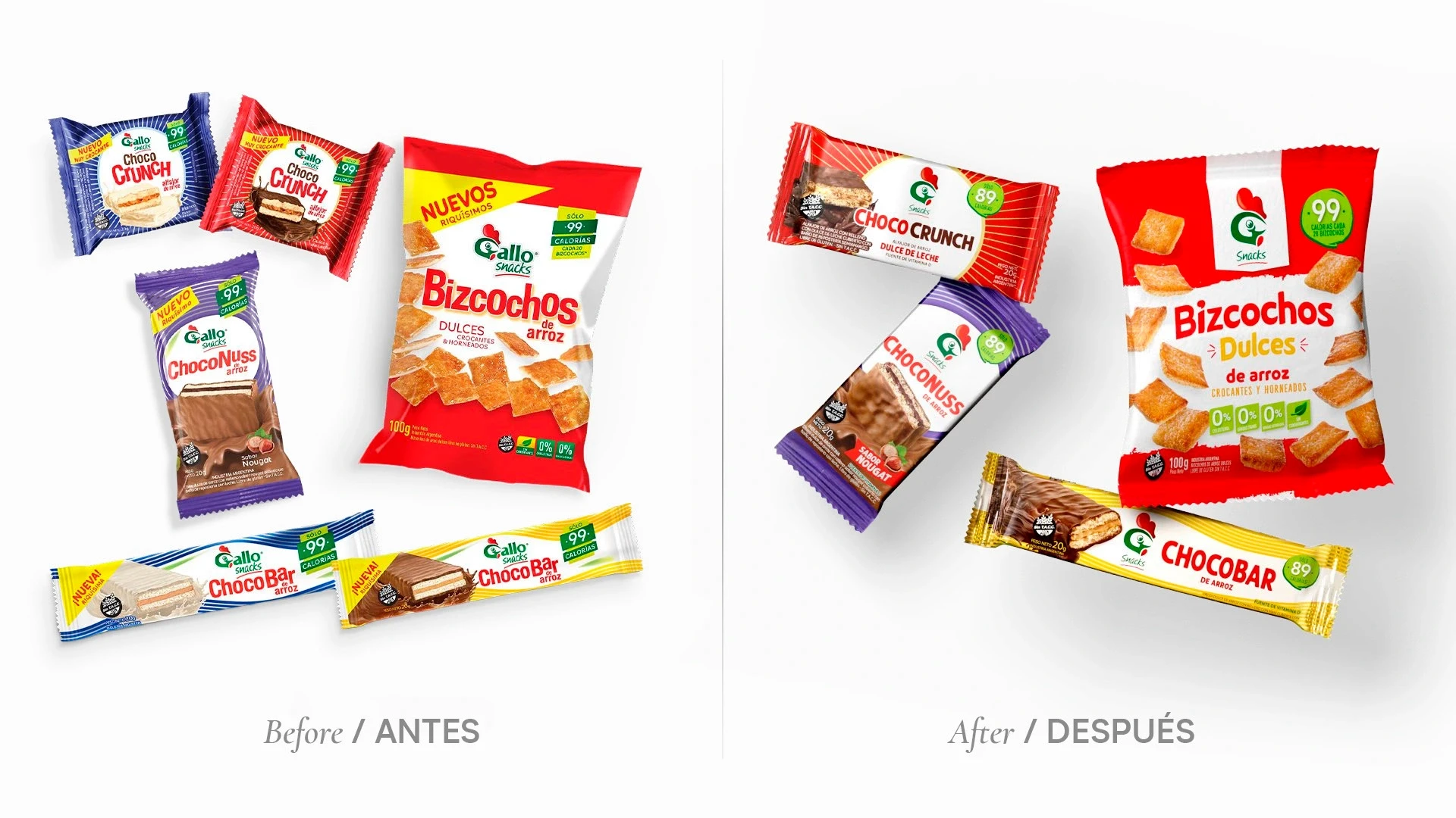
We subsequently evolved the entire packaging portfolio, introducing a new visual architecture, new typography, and new product imagery, while preserving the DNA developed over more than a decade.
The Result
What began as the launch of an innovative product ultimately became the creation of one of the strongest brands in the category.
More than simply designing packaging, we have supported the evolution of Gallo Snacks throughout the years, adapting its identity to every stage of growth without ever losing its essence.
After fourteen years of working together, the brand continues to expand through new products and new opportunities—demonstrating that when branding is built with a long-term vision, it can evolve, become simpler, and continue to grow without losing recognition.
Because great brands are not designed only once. They are built, evolved, and strengthened over time.
And that is precisely the story of Gallo Snacks.
Gallo Snacks
How We Built a Brand That Created a Category
Background
In 2012, very few people imagined that rice could become a snack.
The category was virtually nonexistent, and the challenge was considerable: transforming a product historically associated with traditional meals into a delicious, modern, and healthy option that could be enjoyed at any time of day.
Molinos Río de la Plata entrusted Grupo Berro with developing the identity for this new venture. The goal was not simply to design packaging, but to build a brand capable of creating an entirely new category.
That is how Gallo Snacks was born.
Nearly fifteen years later, that vision has become a resounding success. Today, Gallo Snacks is a leading name in healthy snacks in Argentina, with a presence in convenience stores, supermarkets, and retail outlets throughout the country. Grupo Berro has continued to support the brand’s evolution from day one.
The Project
From the initial launch, we worked closely with the client to build a strong, flexible brand architecture designed for growth.
Over the years, we developed the branding, packaging design, and identity for an extensive family of products, continually adding new offerings such as wafers, cookies, chips, crackers, bars, popcorn, and a variety of special editions.
Each launch presented a new challenge: creating products with their own distinctive personalities while maintaining the consistency of a brand that needed to be instantly recognizable. This balance between innovation and consistency became the foundation upon which the entire Gallo Snacks portfolio was built.
The brand identity evolved as well.
As the brand grew, we realized that the recognition achieved by the historic rooster symbol allowed us to take the identity one step further. Applying the principle that “less is more,” we proposed simplifying the brand by removing the word “Gallo” and retaining only the “G” together with its iconic symbol.
Very few brands can reduce their identity to a single graphic sign. This synthesis reflected a brand that had already built a powerful connection with consumers.
We subsequently evolved the entire packaging portfolio, introducing a new visual architecture, new typography, and new product imagery, while preserving the DNA developed over more than a decade.
The Result
What began as the launch of an innovative product ultimately became the creation of one of the strongest brands in the category.
More than simply designing packaging, we have supported the evolution of Gallo Snacks throughout the years, adapting its identity to every stage of growth without ever losing its essence.
After fourteen years of working together, the brand continues to expand through new products and new opportunities—demonstrating that when branding is built with a long-term vision, it can evolve, become simpler, and continue to grow without losing recognition.
Because great brands are not designed only once. They are built, evolved, and strengthened over time.
And that is precisely the story of Gallo Snacks.
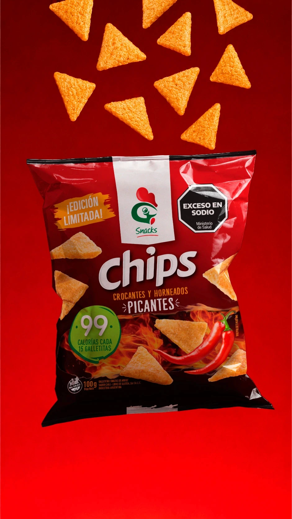
Cada nueva edición es una oportunidad para seguir innovando, sin perder nunca la esencia de la marca.
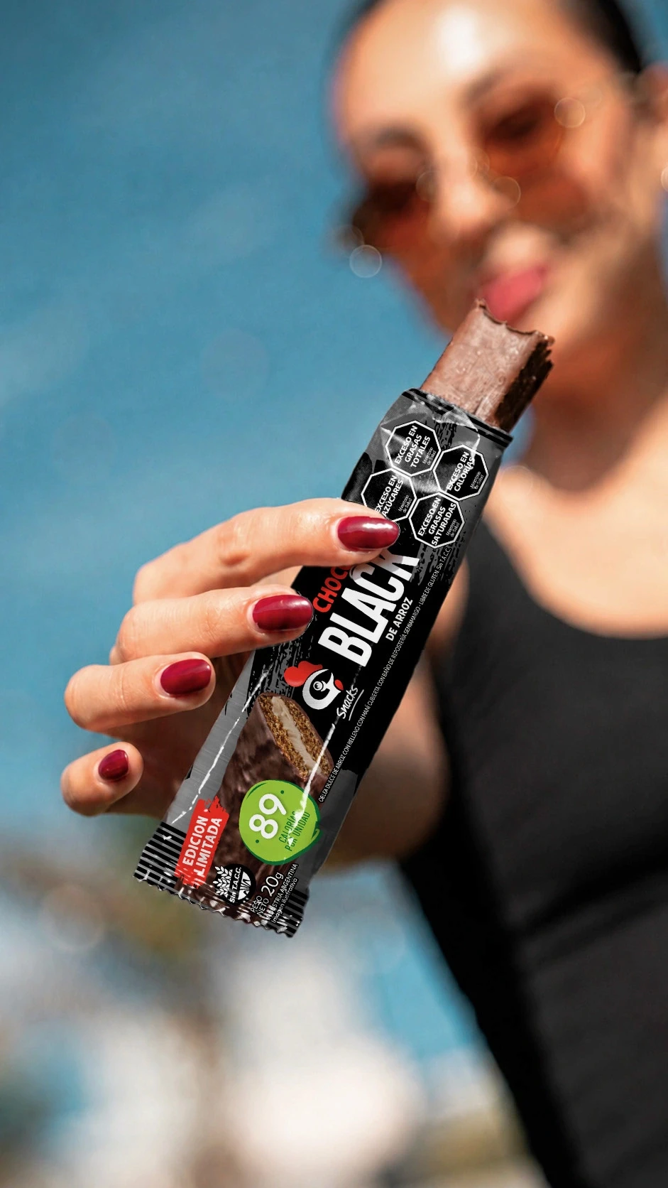
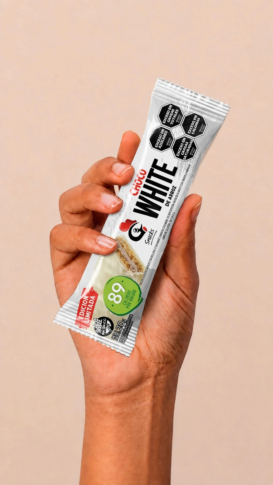
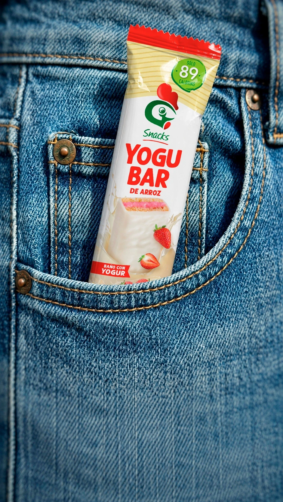
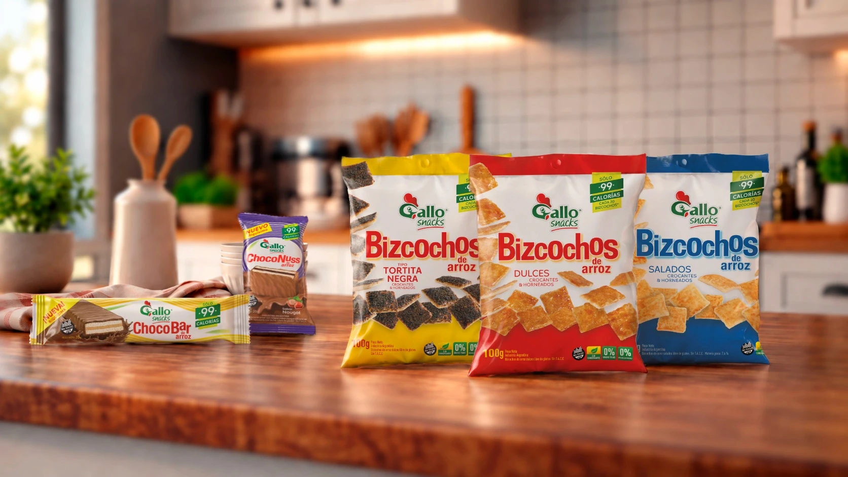
En 2012, muy pocos imaginaban que el arroz podía convertirse en un snack. Así nació Gallo Snacks y, con ella, la primera generación de toda su familia de productos.
En el año 2019, hicimos una evolución de toda la línea de packaging incorporando una nueva arquitectura visual, nuevas tipografías y nuevas imágenes de los productos, manteniendo intacto el ADN.
El logo también ha evolucionado a lo largo de los años.
Porque las grandes marcas no se diseñan una sola vez. Se construyen, evolucionan y fortalecen con el tiempo.


Contact us
" height="24px" id="Y_SogtFLR" width="23.998702773987908px"/></svg>)
" height="23.91171428571431px" id="eAEKng1cA" width="24px"/></svg>)
" height="24px" id="bloY09y18" width="24px"/></svg>)
" height="15.080483675527217px" id="P2vInqImQ" transform="translate(0 4)" width="23.999999787140037px"/></svg>)
Buenos Aires
Headquarters
Gonzalo Berro
gberro@grupoberro.com
+54 911 4579 5555
Laura García
lgarcia@grupoberro.com
+54 911 6542 4090
2005-2026 @ Berro Group
Contact us
Buenos Aires
Headquarters
Gonzalo Berro
gberro@grupoberro.com
+54 911 4579 5555
Laura García
lgarcia@grupoberro.com
+54 911 6542 4090
2005-2026 @ Berro Group
Contact us
Buenos Aires
Headquarters