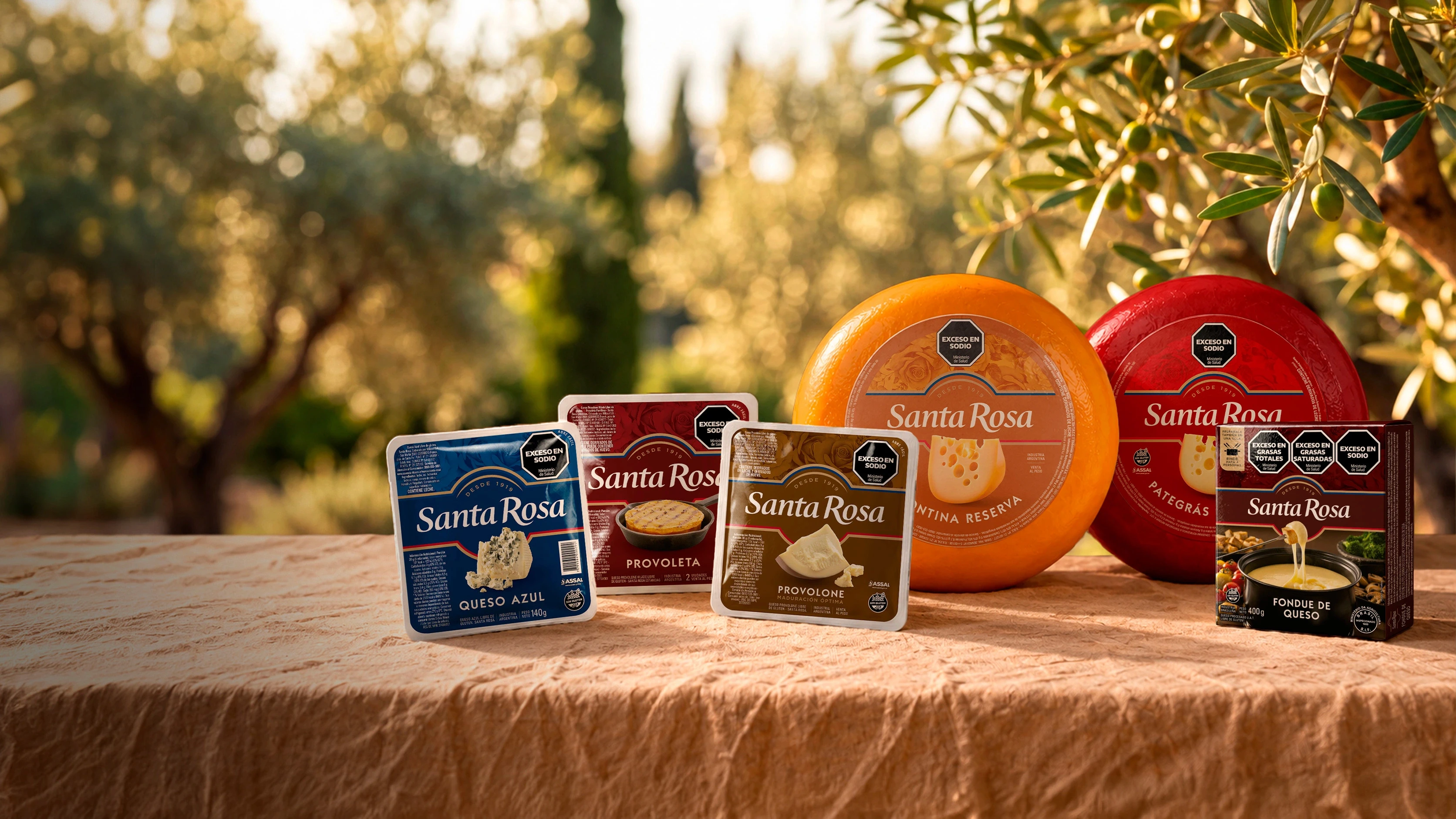
Santa Rosa
Packaging Design.
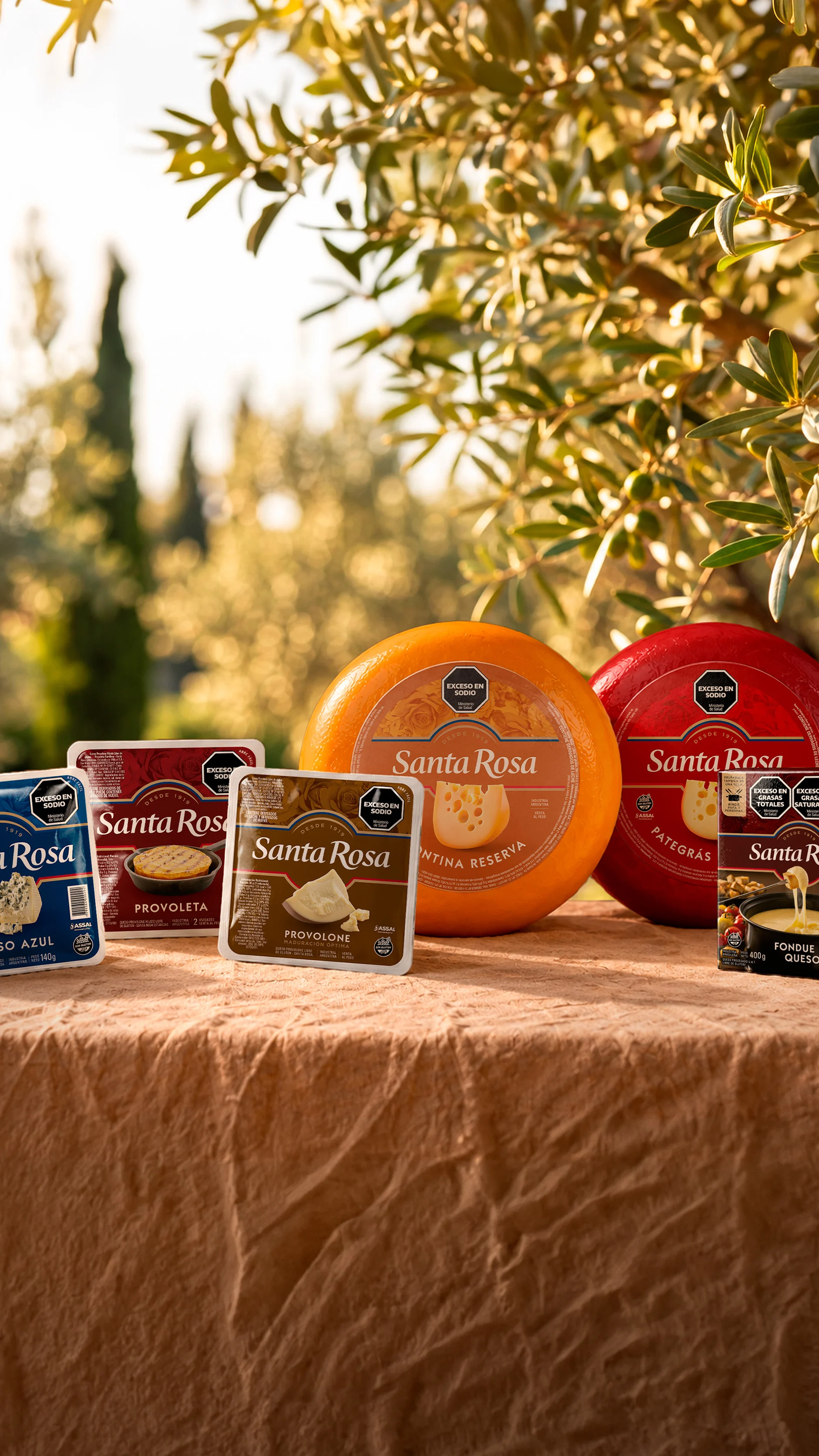
Santa Rosa
Packaging Design.
Client
Santa Rosa
Service
Packaging Design.
Year
2026
Santa Rosa.
An identity that reflects its leadership.
Santa Rosa is Argentina’s leading cheese brand. Savencia invited us to refresh its identity and packaging, reinforcing that position through a warmer, more contemporary and recognizable visual expression.
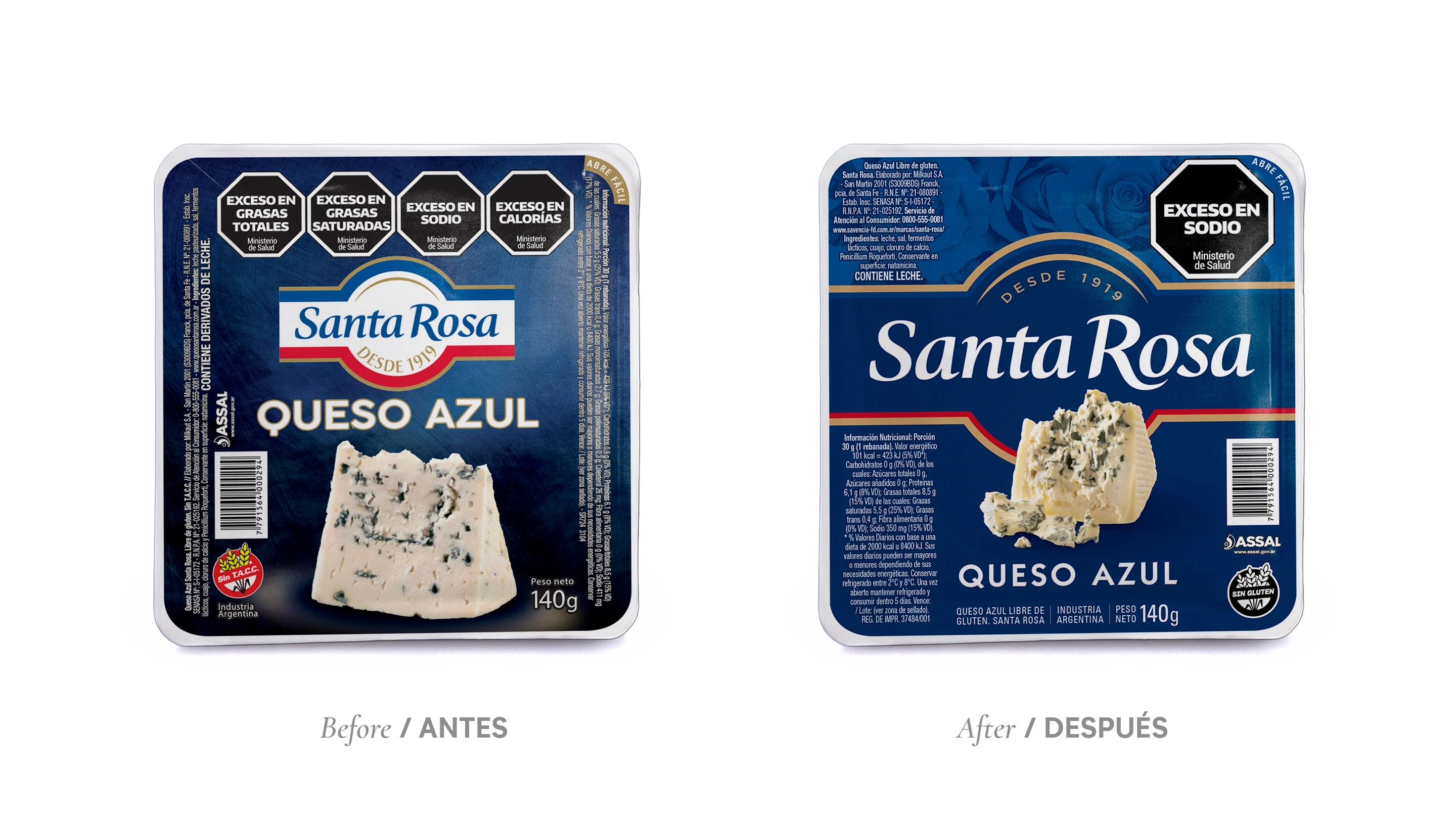
The challenge went beyond modernizing its appearance. The previous design relied too heavily on the logo for differentiation: replacing it with a competitor’s logo stripped the packaging of its personality. We needed the entire identity to communicate Santa Rosa.
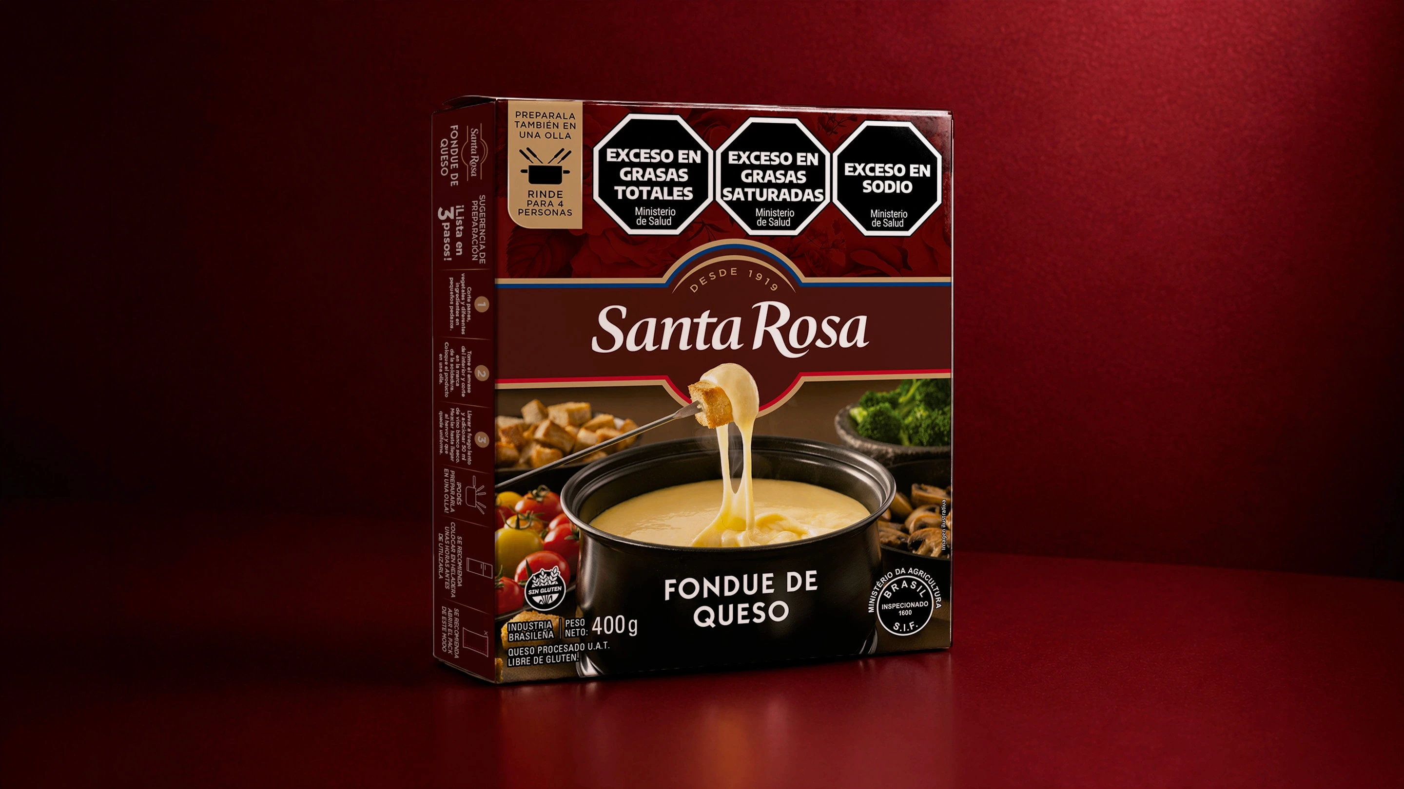
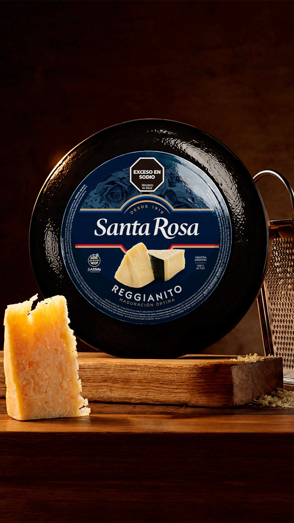
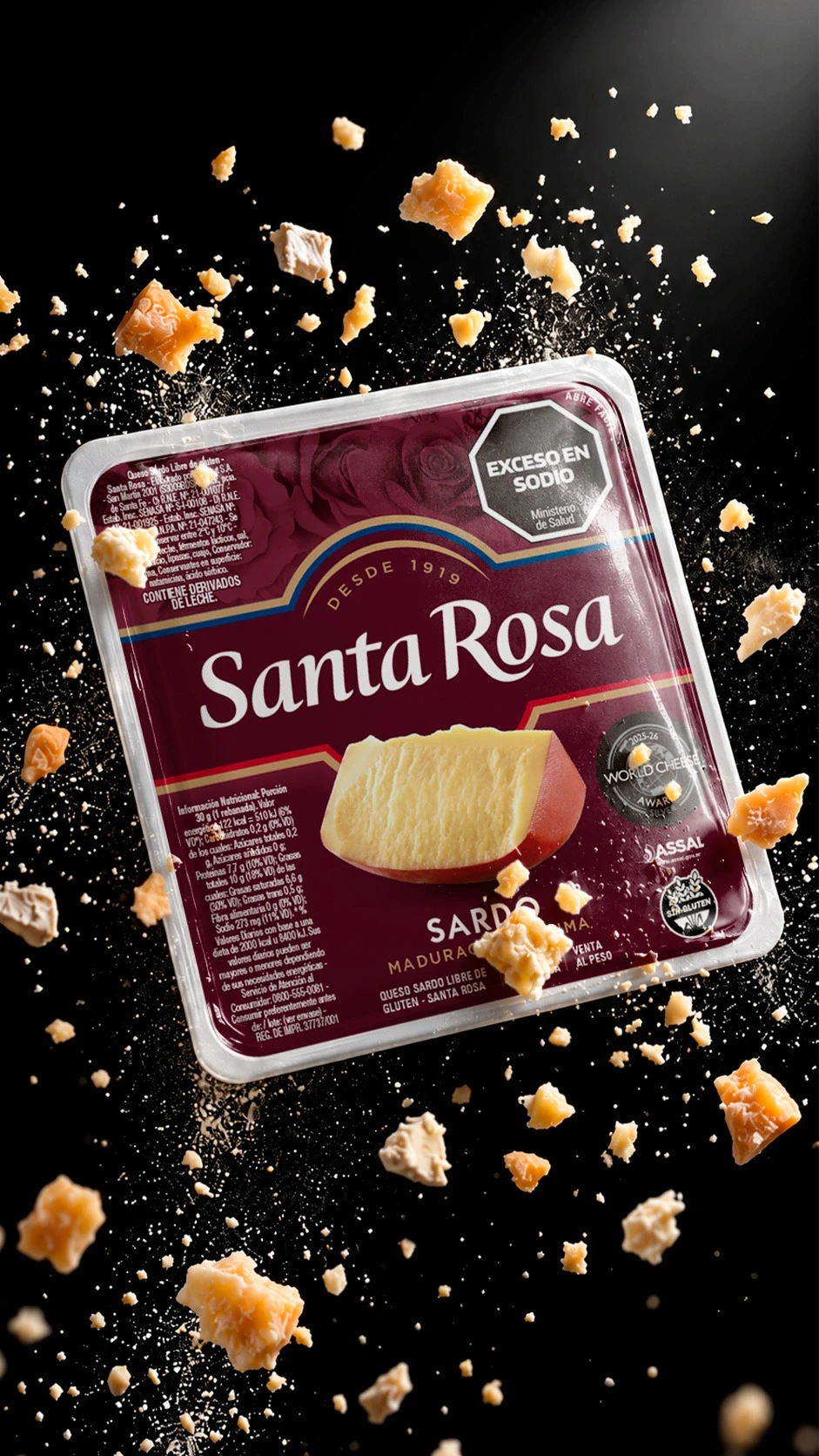
The answer lay within the brand itself. Its logo, which had evolved from a traditional livestock branding mark, retained a distinctive arch. We reinterpreted that element and made it the foundation of the new visual system: a shape that could organize the design and connect the entire product family.
We subtly redrew the logo, respecting its heritage and recognition, and gave it the strongest possible presence on every pack and label. It evolved from an element placed on top of the design into an integral part of its structure. Because we believe that being Santa Rosa is the brand’s greatest differentiator, both against competitors and supermarket private labels.
A rose pattern across the upper section of the packs completes the identity. This subtle detail adds another layer of meaning and strengthens the connection to the brand name. We also retained the colors associated with each cheese variety, preserving familiar cues for consumers.
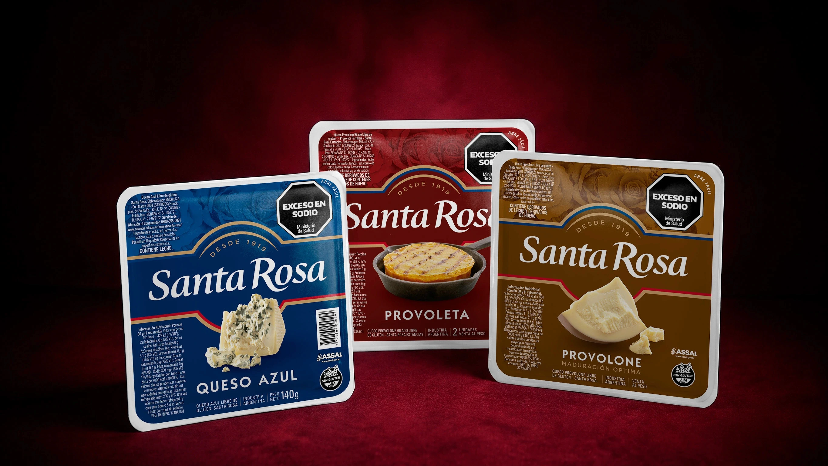
The result is a cohesive, recognizable family across different packaging formats, with greater brand presence and a distinctive personality expressed in every product.
A refreshed Santa Rosa, built on what makes it uniquely its own.
Santa Rosa.
An identity that reflects its leadership.
Santa Rosa is Argentina’s leading cheese brand. Savencia invited us to refresh its identity and packaging, reinforcing that position through a warmer, more contemporary and recognizable visual expression.
The challenge went beyond modernizing its appearance. The previous design relied too heavily on the logo for differentiation: replacing it with a competitor’s logo stripped the packaging of its personality. We needed the entire identity to communicate Santa Rosa.
The answer lay within the brand itself. Its logo, which had evolved from a traditional livestock branding mark, retained a distinctive arch. We reinterpreted that element and made it the foundation of the new visual system: a shape that could organize the design and connect the entire product family.
We subtly redrew the logo, respecting its heritage and recognition, and gave it the strongest possible presence on every pack and label. It evolved from an element placed on top of the design into an integral part of its structure. Because we believe that being Santa Rosa is the brand’s greatest differentiator, both against competitors and supermarket private labels.
A rose pattern across the upper section of the packs completes the identity. This subtle detail adds another layer of meaning and strengthens the connection to the brand name. We also retained the colors associated with each cheese variety, preserving familiar cues for consumers.
The result is a cohesive, recognizable family across different packaging formats, with greater brand presence and a distinctive personality expressed in every product.
A refreshed Santa Rosa, built on what makes it uniquely its own.
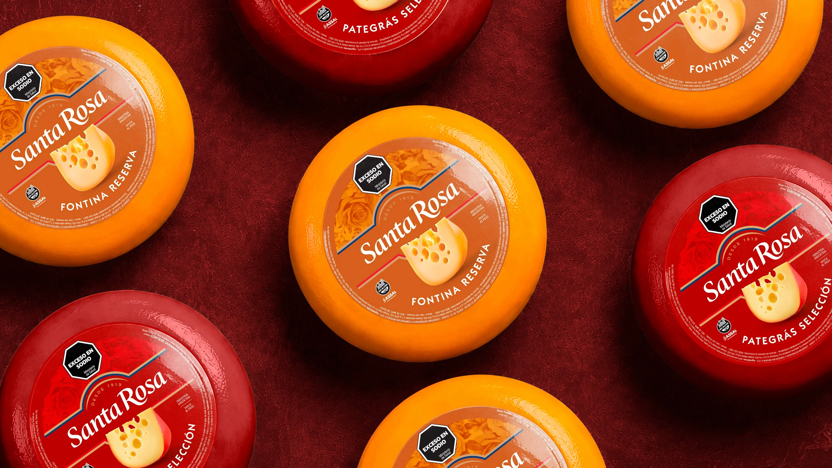
We reinterpreted the arch of the logotype and made it the foundation of the new visual system: a shape that could organize the design and connect the entire product family.
Contact us
" height="24px" id="Y_SogtFLR" width="23.998702773987908px"/></svg>)
" height="23.91171428571431px" id="eAEKng1cA" width="24px"/></svg>)
" height="24px" id="bloY09y18" width="24px"/></svg>)
" height="15.080483675527217px" id="P2vInqImQ" transform="translate(0 4)" width="23.999999787140037px"/></svg>)
Buenos Aires
Headquarters
Gonzalo Berro
gberro@grupoberro.com
+54 911 4579 5555
Laura García
lgarcia@grupoberro.com
+54 911 6542 4090
2005-2026 @ Berro Group
Contact us
Buenos Aires
Headquarters
Gonzalo Berro
gberro@grupoberro.com
+54 911 4579 5555
Laura García
lgarcia@grupoberro.com
+54 911 6542 4090
2005-2026 @ Berro Group
Contact us
Buenos Aires
Headquarters