Rooster Snacks
Branding & Identity.
Packaging Design.
Client
Río de la Plata Mills
Service
Branding & Identity.
Packaging Design.
Year
2022
Background
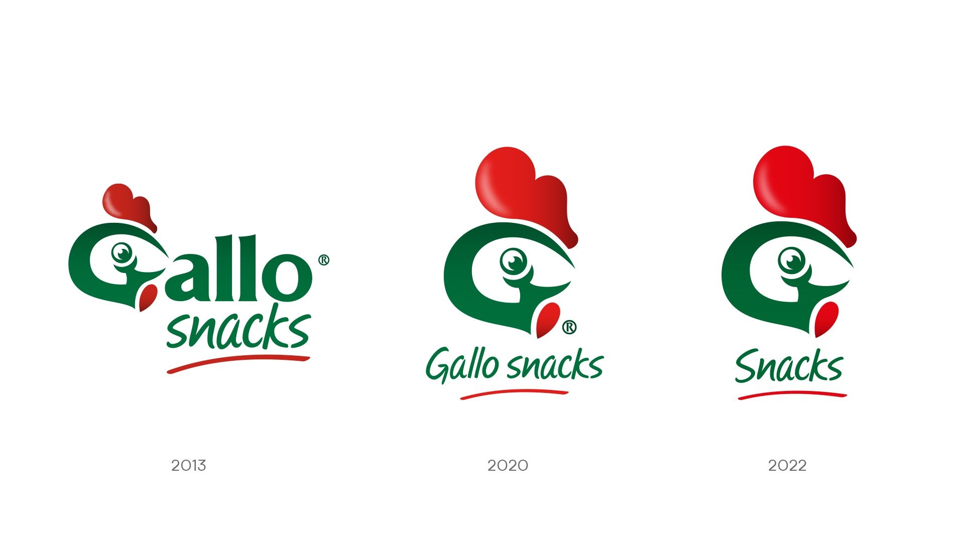
In 2012, very few people thought that rice could be a snack. Molinos, following the global trend towards healthy food, called upon Grupo Berro to develop the identity and the entire product line. Today, 10 years later, with a solid leadership in the healthy snacks category, Molinos Río de la Plata again chose Grupo Berro to redesign the complete line. Seizing the opportunity, we proposed a redesign of the brand.
The project
"Less is more," said the renowned architect Mies Van der Rohe. In line with that concept, Grupo Berro proposed a synthesis of the identity of Gallo Snacks by removing four letters from the main name, highlighting only the symbol of the rooster applied to the "G." Very few brands are naturally recognized by consumers without the need to read them. With the new design, Gallo demonstrates it is part of that privileged group.
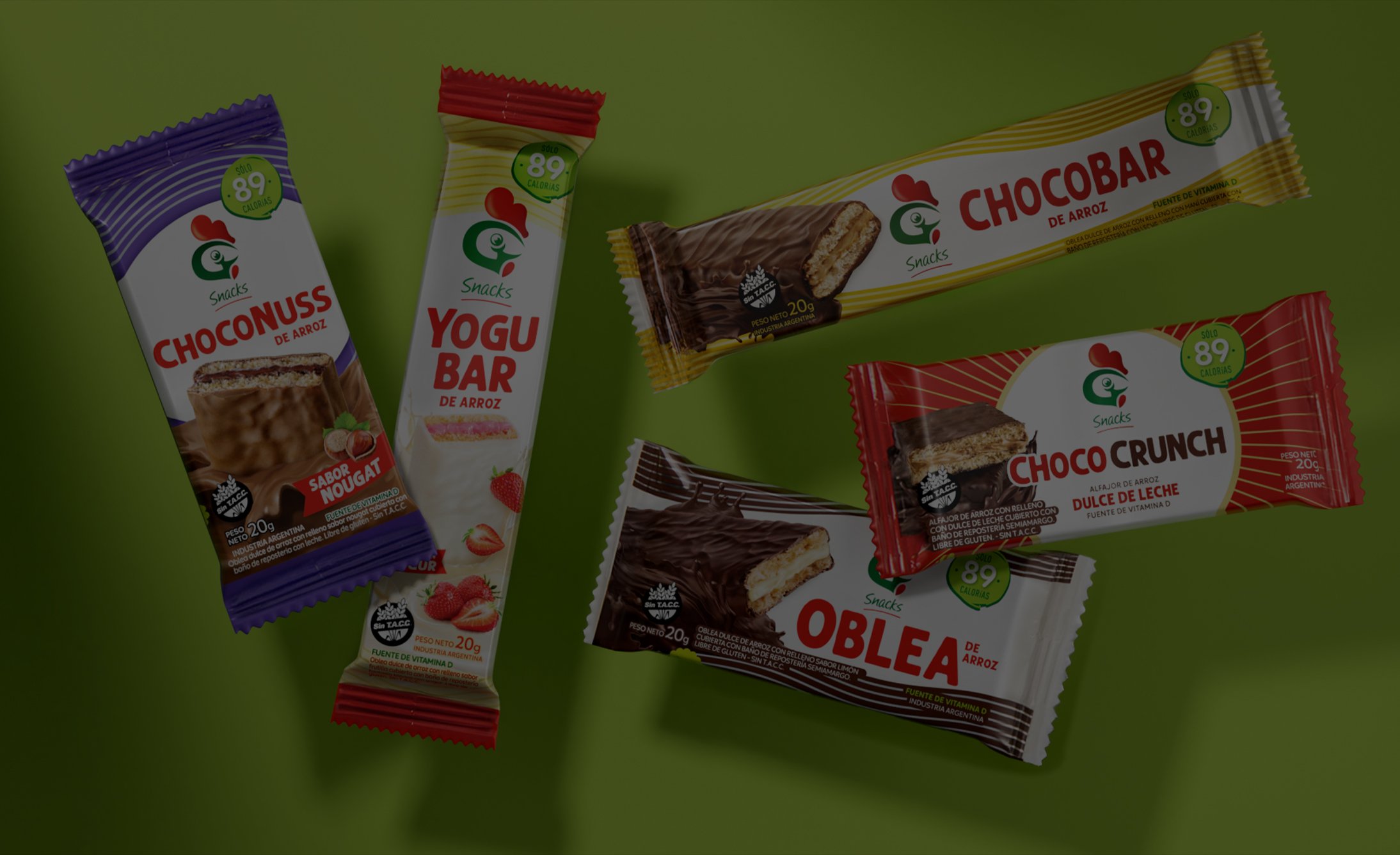
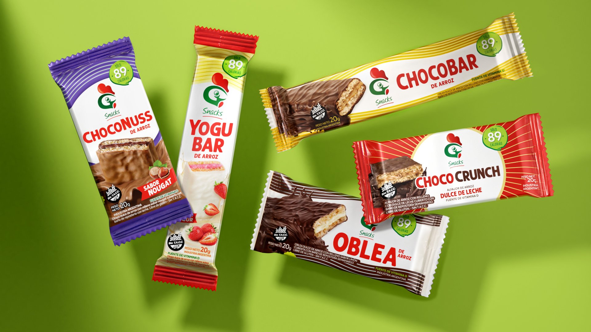
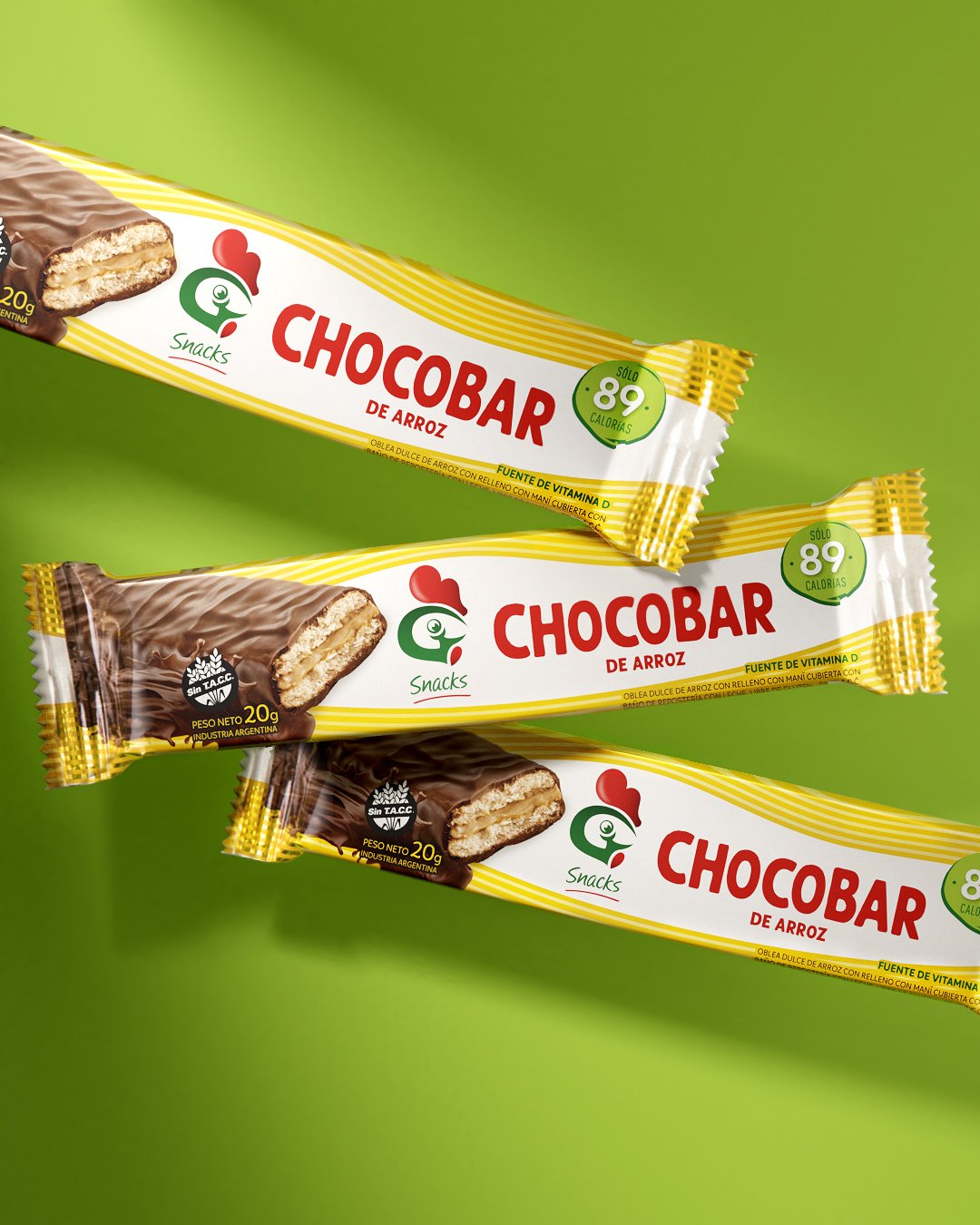
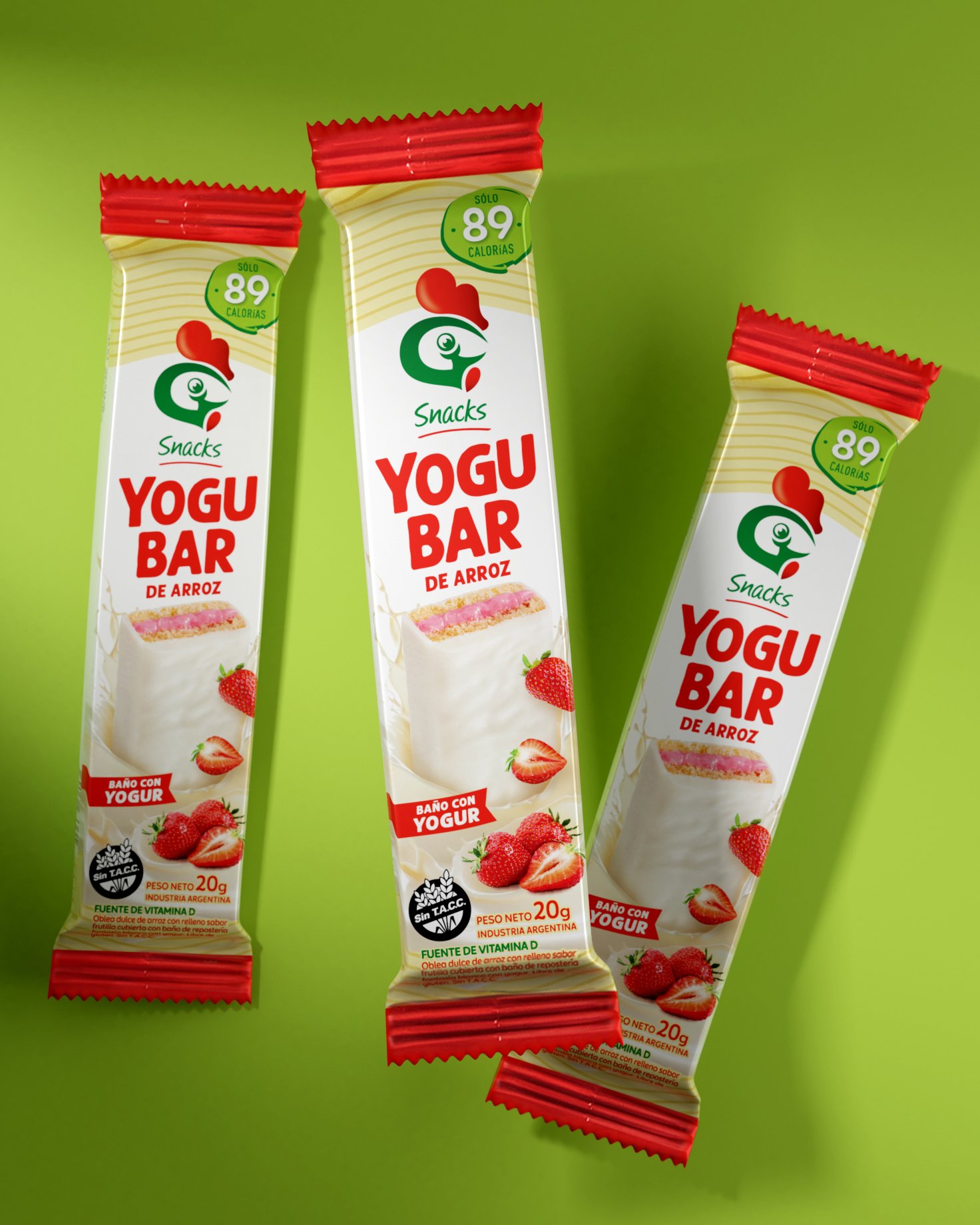
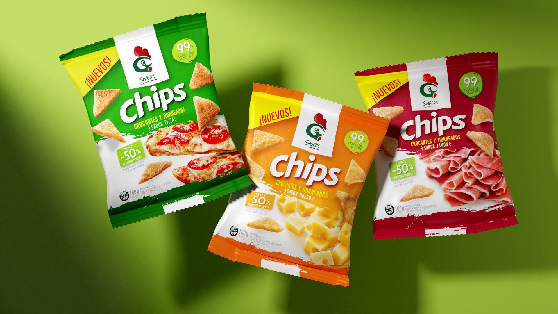
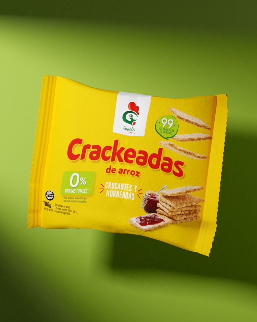
In the case of the packs, respecting the DNA already built over a decade, we defined a new typography for the names and changed the images, which were hyper-realistic illustrations, to real photographs of the products that show them as rich and authentic.
The result
The new branding puts Gallo Snacks at the forefront of design and shows the clear decision of the client to offer constant innovation. The new identity is summarized in a letter and highlights the hierarchy of a centenary brand.
Background
In 2012, very few people thought that rice could be a snack. Molinos, following the global trend towards healthy food, called upon Grupo Berro to develop the identity and the entire product line. Today, 10 years later, with a solid leadership in the healthy snacks category, Molinos Río de la Plata again chose Grupo Berro to redesign the complete line. Seizing the opportunity, we proposed a redesign of the brand.
The project
"Less is more," said the renowned architect Mies Van der Rohe. In line with that concept, Grupo Berro proposed a synthesis of the identity of Gallo Snacks by removing four letters from the main name, highlighting only the symbol of the rooster applied to the "G." Very few brands are naturally recognized by consumers without the need to read them. With the new design, Gallo demonstrates it is part of that privileged group.
In the case of the packs, respecting the DNA already built over a decade, we defined a new typography for the names and changed the images, which were hyper-realistic illustrations, to real photographs of the products that show them as rich and authentic.
The result
The new branding puts Gallo Snacks at the forefront of design and shows the clear decision of the client to offer constant innovation. The new identity is summarized in a letter and highlights the hierarchy of a centenary brand.


Contact us
" height="24px" id="Y_SogtFLR" width="23.998702773987908px"/></svg>)
" height="23.91171428571431px" id="eAEKng1cA" width="24px"/></svg>)
" height="24px" id="bloY09y18" width="24px"/></svg>)
" height="15.080483675527217px" id="P2vInqImQ" transform="translate(0 4)" width="23.999999787140037px"/></svg>)
Buenos Aires
Headquarters
Gonzalo Berro
gberro@grupoberro.com
+54 911 4579 5555
Laura García
lgarcia@grupoberro.com
+54 911 6542 4090
2005-2026 @ Berro Group
Contact us
Buenos Aires
Headquarters
Gonzalo Berro
gberro@grupoberro.com
+54 911 4579 5555
Laura García
lgarcia@grupoberro.com
+54 911 6542 4090
2005-2026 @ Berro Group
Contact us
Buenos Aires
Headquarters