
José Olé
Branding & Identity.
Packaging Design.
Client
Ajinomoto
Service
Branding & Identity.
Packaging Design.
Year
2024
José Olé — Brand and Packaging Redesign
Ajinomoto Foods North America
José Olé is an iconic brand of frozen Mexican food in the U.S. market. However, its visual identity had become trapped in a stereotypical and unconvincing style that failed to convey the true cultural richness and joy that characterize Mexico.
At the initial stage of the project, Gonzalo Berro traveled to the United States to visit supermarkets, observe how the brand looked at the point of sale, and compare it with its direct competitors. The diagnosis was clear: the previous design tried to "look Mexican," but it did not manage to express authenticity or connect with the brand's original spirit.
Based on that observation, we defined a new approach: to reconstruct the visual DNA from a genuine, respectful, and contemporary place, recovering real elements from the Mexican graphic universe without falling into clichés or caricatures.
To achieve this:
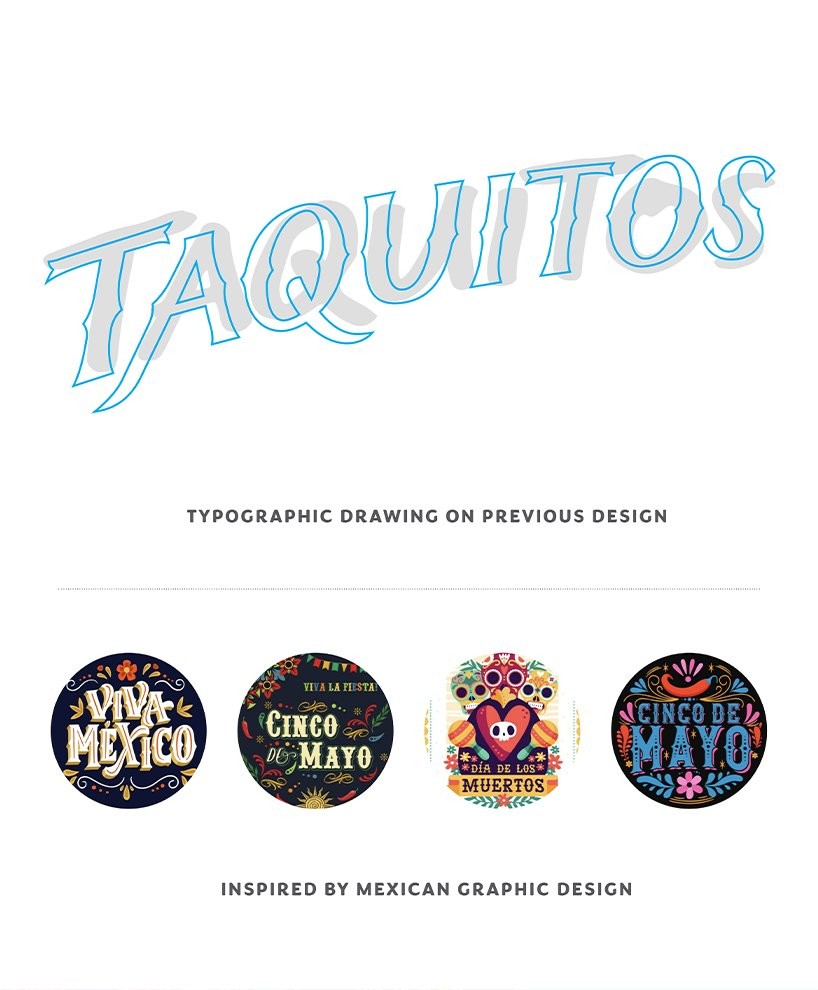
We studied authentic typographies and visual codes: street signs, markets, hand-painted posters, and popular signage from different regions.
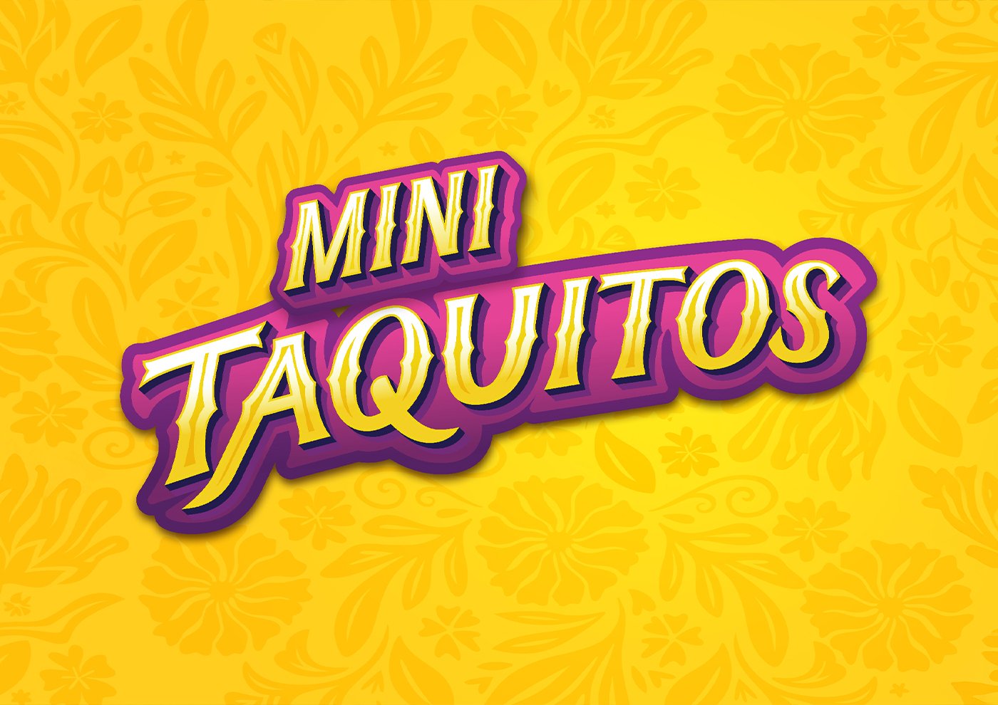
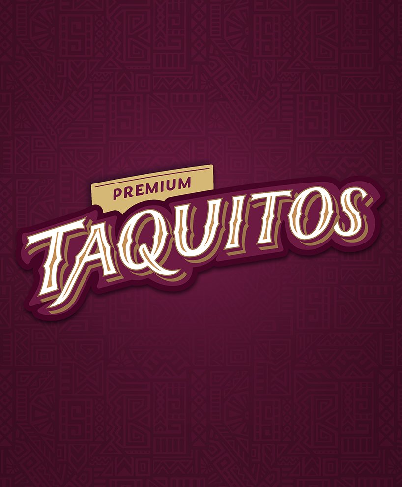
We redrew the brands letter by letter, creating typefaces with strokes inspired by traditional graphics, but with a modern and clear execution.
We incorporated graphic and ornamental details from Mexican cultural patterns, reinterpreted with contemporary sensitivity.
We strengthened the architecture of the packaging, improving the hierarchy, product presence, and the strength of the brand block.
We updated the color palette, seeking vibrant, cheerful, and warm colors that are true to the Mexican spirit but adapted to the U.S. market.
The José Olé brand, present in the U.S. since 2000, was built on a very clear premise: to offer delicious and comforting Mexican food made with real ingredients —tender cuts of meat, authentic cheese, baked tortillas, and traditional seasonings—.
This passion for quality and flavor was also the starting point for our redesign.
The new packaging system balances the artisanal with the modern. The brand now looks refreshed, more authentic, and with its own personality, yet it maintains its familiar, approachable, and cheerful spirit.
Today, José Olé stands out again on shelves, with packs that celebrate its cultural origin and communicate what has always been its greatest promise: to bring the flavor, color, and fun of Mexican food to any moment of the day.
José Olé — Brand and Packaging Redesign
Ajinomoto Foods North America
José Olé is an iconic brand of frozen Mexican food in the U.S. market. However, its visual identity had become trapped in a stereotypical and unconvincing style that failed to convey the true cultural richness and joy that characterize Mexico.
At the initial stage of the project, Gonzalo Berro traveled to the United States to visit supermarkets, observe how the brand looked at the point of sale, and compare it with its direct competitors. The diagnosis was clear: the previous design tried to "look Mexican," but it did not manage to express authenticity or connect with the brand's original spirit.
Based on that observation, we defined a new approach: to reconstruct the visual DNA from a genuine, respectful, and contemporary place, recovering real elements from the Mexican graphic universe without falling into clichés or caricatures.
To achieve this:
We studied authentic typographies and visual codes: street signs, markets, hand-painted posters, and popular signage from different regions.
We redrew the brands letter by letter, creating typefaces with strokes inspired by traditional graphics, but with a modern and clear execution.
We incorporated graphic and ornamental details from Mexican cultural patterns, reinterpreted with contemporary sensitivity.
We strengthened the architecture of the packaging, improving the hierarchy, product presence, and the strength of the brand block.
We updated the color palette, seeking vibrant, cheerful, and warm colors that are true to the Mexican spirit but adapted to the U.S. market.
The José Olé brand, present in the U.S. since 2000, was built on a very clear premise: to offer delicious and comforting Mexican food made with real ingredients —tender cuts of meat, authentic cheese, baked tortillas, and traditional seasonings—.
This passion for quality and flavor was also the starting point for our redesign.
The new packaging system balances the artisanal with the modern. The brand now looks refreshed, more authentic, and with its own personality, yet it maintains its familiar, approachable, and cheerful spirit.
Today, José Olé stands out again on shelves, with packs that celebrate its cultural origin and communicate what has always been its greatest promise: to bring the flavor, color, and fun of Mexican food to any moment of the day.


The new packaging system balances the artisanal with the modern. The brand now looks renewed, more authentic, and has its own personality, but it maintains its family spirit, closeness, and joy.
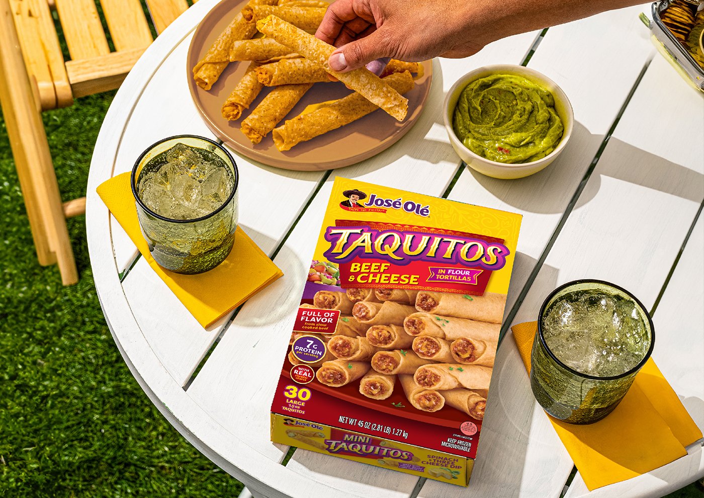


Today, José Olé stands out again on the shelf, with packs that celebrate its cultural origin and communicate what has always been its greatest promise: to bring the flavor, color, and fun of Mexican food to any moment of the day.


Contact us
" height="24px" id="Y_SogtFLR" width="23.998702773987908px"/></svg>)
" height="23.91171428571431px" id="eAEKng1cA" width="24px"/></svg>)
" height="24px" id="bloY09y18" width="24px"/></svg>)
" height="15.080483675527217px" id="P2vInqImQ" transform="translate(0 4)" width="23.999999787140037px"/></svg>)
Buenos Aires
Headquarters
Gonzalo Berro
gberro@grupoberro.com
+54 911 4579 5555
Laura García
lgarcia@grupoberro.com
+54 911 6542 4090
2005-2026 @ Berro Group
Contact us
Buenos Aires
Headquarters
Gonzalo Berro
gberro@grupoberro.com
+54 911 4579 5555
Laura García
lgarcia@grupoberro.com
+54 911 6542 4090
2005-2026 @ Berro Group
Contact us
Buenos Aires
Headquarters