Ampersand
Branding & Identity.
Packaging Design.
Client
Osborne
Service
Branding & Identity.
Packaging Design.
Year
2013
Tackling a project from the very beginning is the best way to enhance design work. Osborne, one of the largest beverage companies in Europe, invited us from the first moment to think together about a new launch.
The challenge
In 2013, the star of the spirits world in Europe was gin, or “ginebra,” as it is called in Spain. A category with very high competition featuring many renowned brands and a very varied offering, both in flavors and presentations. Osborne, which distributed an imported brand and saw large sales volumes, decided to create and launch a new brand. To do this, different “territories” were developed, seeking the ideal profile to establish a different, original brand with character.
The opportunity
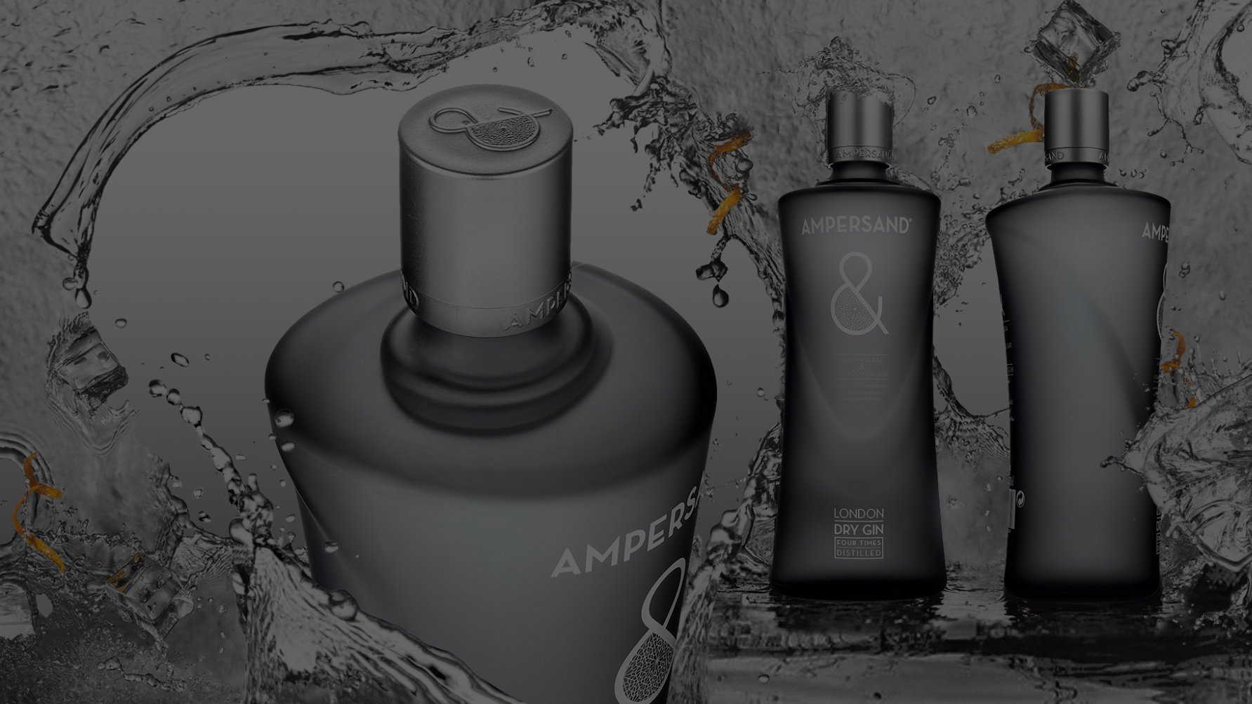
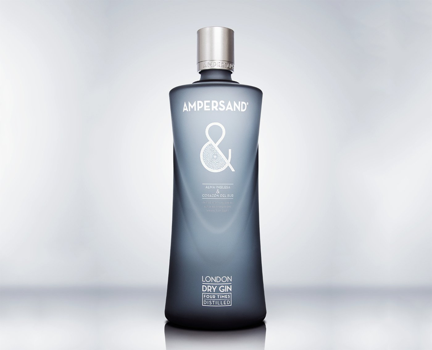
Having thoroughly analyzed the category and keeping the competition in mind, it was decided to combine the English flavor of gin with Spanish warmth. Could we incorporate two such distinct identities into one package? The chosen brand was Ampersand. And with that duality of the mix of Anglo-Saxon and Latin elements, we designed a “double” bottle that had one profile when viewed from the front and another from the side, creating not only an innovative object but also the idea of a whole, a sum of parts.
The result
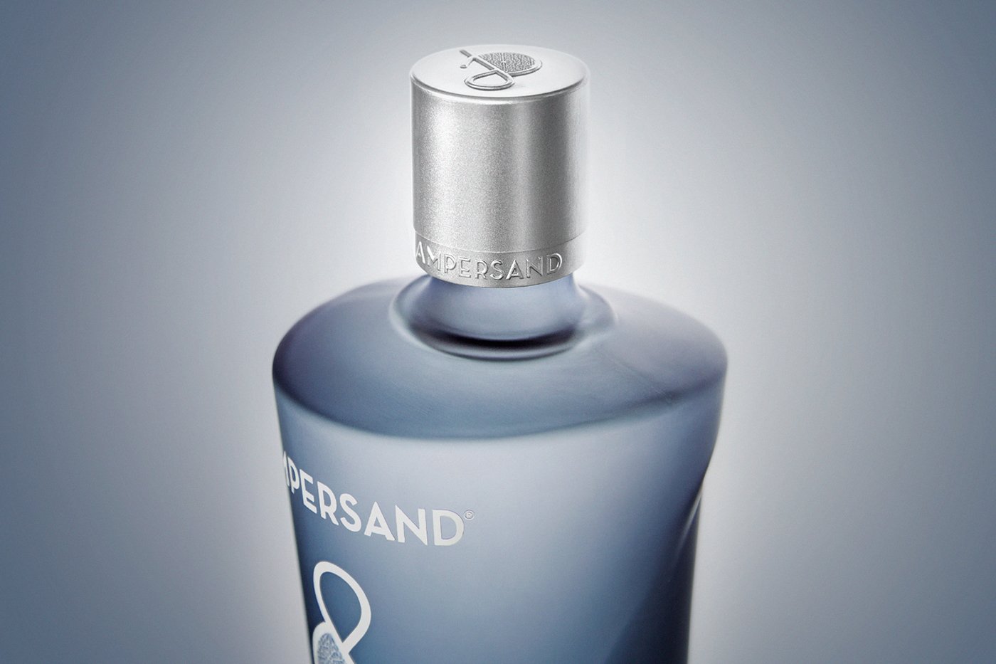
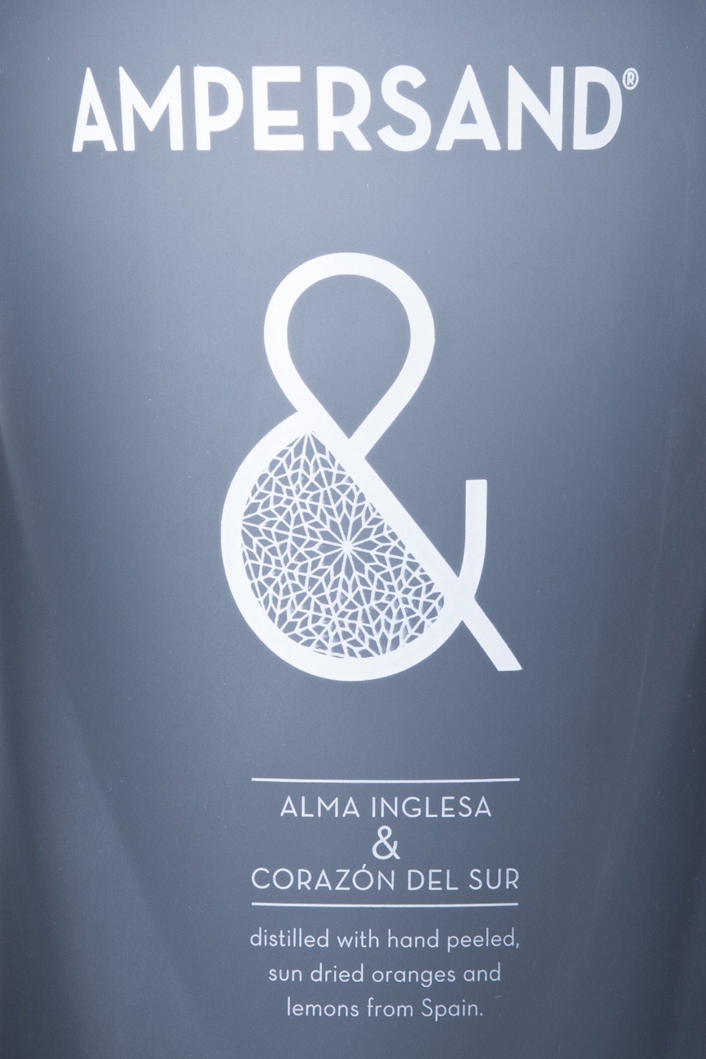
The essence of Ampersand is represented by the icon “&,” which synthesizes this fusion between the English flavor and the Spanish production. The packaging is bilingual: it speaks of “English soul & southern heart,” and then clarifies, in English, that it is a distilled product made with hand-peeled oranges. Today, Ampersand ranks among the leading gin brands in the world, distinguished by its elegance and distinction.
Tackling a project from the very beginning is the best way to enhance design work. Osborne, one of the largest beverage companies in Europe, invited us from the first moment to think together about a new launch.
The challenge
In 2013, the star of the spirits world in Europe was gin, or “ginebra,” as it is called in Spain. A category with very high competition featuring many renowned brands and a very varied offering, both in flavors and presentations. Osborne, which distributed an imported brand and saw large sales volumes, decided to create and launch a new brand. To do this, different “territories” were developed, seeking the ideal profile to establish a different, original brand with character.
The opportunity
Having thoroughly analyzed the category and keeping the competition in mind, it was decided to combine the English flavor of gin with Spanish warmth. Could we incorporate two such distinct identities into one package? The chosen brand was Ampersand. And with that duality of the mix of Anglo-Saxon and Latin elements, we designed a “double” bottle that had one profile when viewed from the front and another from the side, creating not only an innovative object but also the idea of a whole, a sum of parts.
The result
The essence of Ampersand is represented by the icon “&,” which synthesizes this fusion between the English flavor and the Spanish production. The packaging is bilingual: it speaks of “English soul & southern heart,” and then clarifies, in English, that it is a distilled product made with hand-peeled oranges. Today, Ampersand ranks among the leading gin brands in the world, distinguished by its elegance and distinction.


Contact us
" height="24px" id="Y_SogtFLR" width="23.998702773987908px"/></svg>)
" height="23.91171428571431px" id="eAEKng1cA" width="24px"/></svg>)
" height="24px" id="bloY09y18" width="24px"/></svg>)
" height="15.080483675527217px" id="P2vInqImQ" transform="translate(0 4)" width="23.999999787140037px"/></svg>)
Buenos Aires
Headquarters
Gonzalo Berro
gberro@grupoberro.com
+54 911 4579 5555
Laura García
lgarcia@grupoberro.com
+54 911 6542 4090
2005-2026 @ Berro Group
Contact us
Buenos Aires
Headquarters
Gonzalo Berro
gberro@grupoberro.com
+54 911 4579 5555
Laura García
lgarcia@grupoberro.com
+54 911 6542 4090
2005-2026 @ Berro Group
Contact us
Buenos Aires
Headquarters