
UAR
Branding & Identity.
Client
Argentina Rugby Union
Service
Branding & Identity.
Year
2023
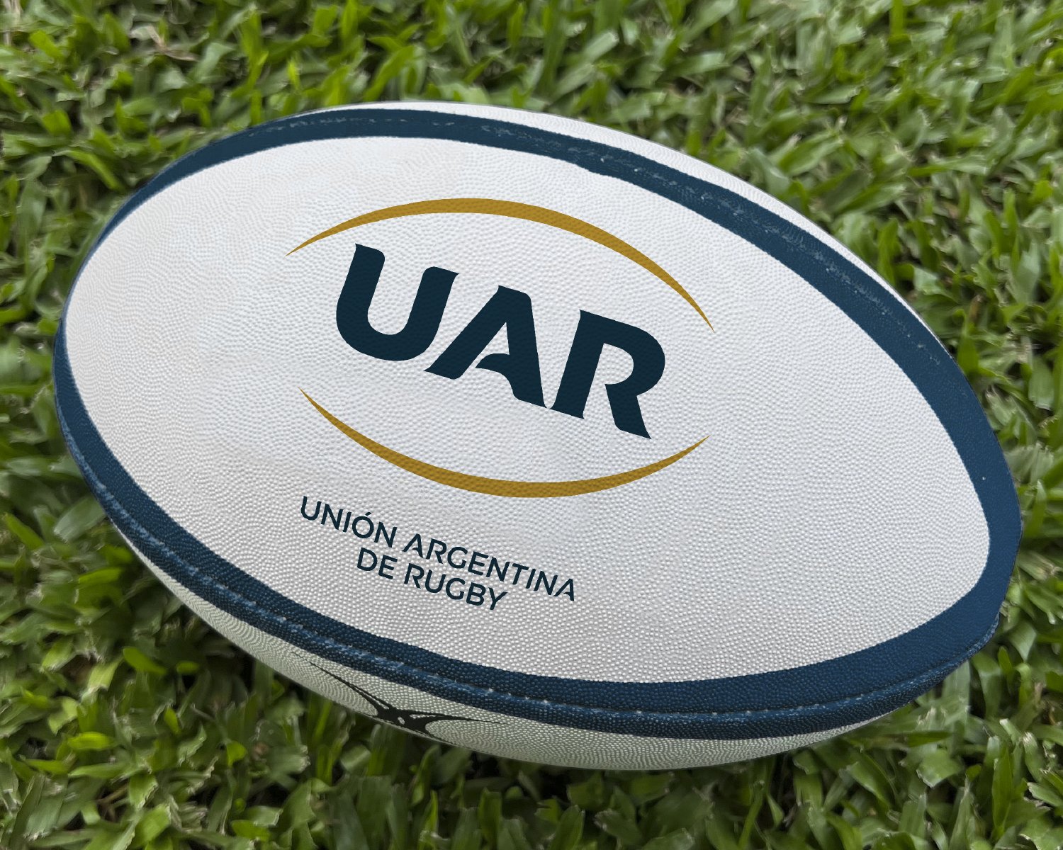
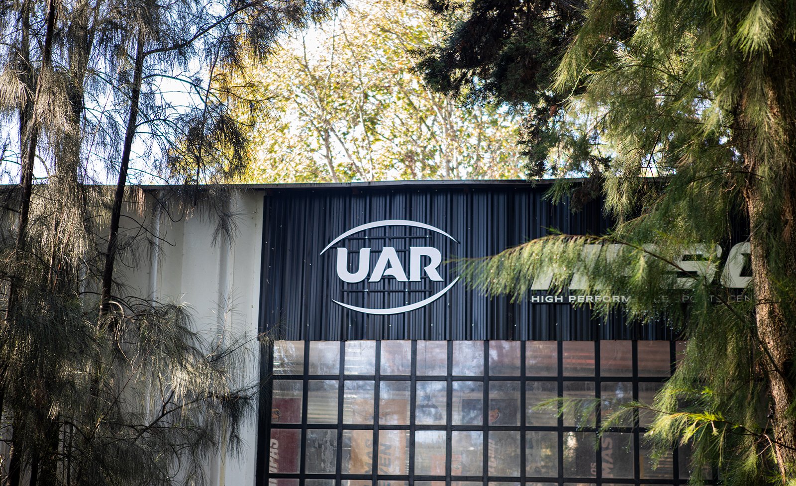
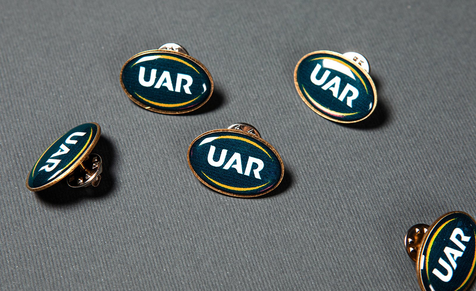
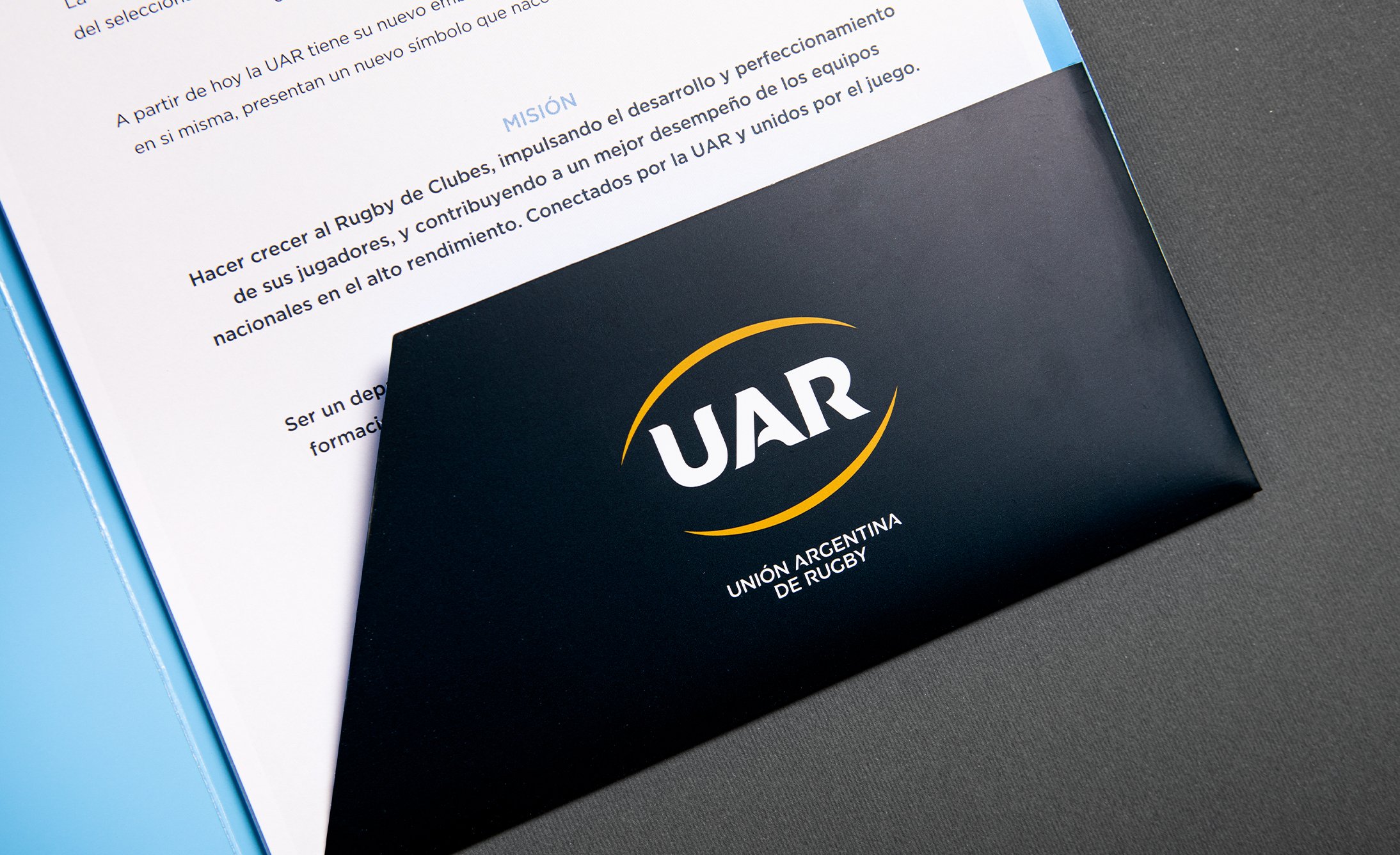
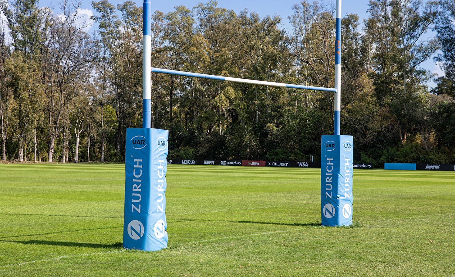
Since its inception in 1899, the Argentine Rugby Union has undergone various transformations, which included changes to its original name and also to its insignias. Throughout history, each of these transformations had the premise of supporting a logical and necessary evolution. For this reason, today we present a new identity design. This is a significant evolution stemming from the strategic plan developed. The goal was to be innovative. The intention was to separate the institution, in its role as an umbrella brand, from the senior national team. The new identity of the UAR is renewed with an exclusive typographic design and distances itself from the figure of the Puma. As of today, the UAR has its new emblem that identifies it, and Los Pumas as a brand in itself present a new symbol that is born from the very history of the team. The objective is to enhance and strengthen the identity, commitment, and communication of the Argentine Rugby Union (UAR) and its teams. The UAR seeks to show and communicate a distinctly institutional positioning and to establish the entity in its role as director of the teams that are part of the Union. The aim is to identify Los Pumas as a symbol that references the recognized identity of the senior national team. The new identity of the Argentine Rugby Union features a logo designed with an exclusive typography embraced by two arcs that are the synthesis of the silhouette of a rugby ball. Branding is a very effective communication tool that helps ensure that such a prestigious symbol remains relevant and always shows its best version. The objective of the project carried out consisted of taking the historical DNA of the UAR and Los Pumas and working on an evolution. The graphic and visual history of the institution was analyzed, and as is common with all centenary brands, it was noted that throughout history there have been a dozen modifications to the shield. The most recent was made a decade ago. On this occasion, we present the new phase of this constant evolution, enhancing the name of the team while always maintaining the identity of the UAR in its full splendor. Analyzing the various designs of history, the starting point was established as the symbol of the puma that could be seen on the national team's jersey in the 1970s. With a renewed design, the new symbol that will now be seen on the national jersey features an authentic and imposing puma with a stronger and more committed character. Read less.
Since its inception in 1899, the Argentine Rugby Union has undergone various transformations, which included changes to its original name and also to its insignias. Throughout history, each of these transformations had the premise of supporting a logical and necessary evolution. For this reason, today we present a new identity design. This is a significant evolution stemming from the strategic plan developed. The goal was to be innovative. The intention was to separate the institution, in its role as an umbrella brand, from the senior national team. The new identity of the UAR is renewed with an exclusive typographic design and distances itself from the figure of the Puma. As of today, the UAR has its new emblem that identifies it, and Los Pumas as a brand in itself present a new symbol that is born from the very history of the team. The objective is to enhance and strengthen the identity, commitment, and communication of the Argentine Rugby Union (UAR) and its teams. The UAR seeks to show and communicate a distinctly institutional positioning and to establish the entity in its role as director of the teams that are part of the Union. The aim is to identify Los Pumas as a symbol that references the recognized identity of the senior national team. The new identity of the Argentine Rugby Union features a logo designed with an exclusive typography embraced by two arcs that are the synthesis of the silhouette of a rugby ball. Branding is a very effective communication tool that helps ensure that such a prestigious symbol remains relevant and always shows its best version. The objective of the project carried out consisted of taking the historical DNA of the UAR and Los Pumas and working on an evolution. The graphic and visual history of the institution was analyzed, and as is common with all centenary brands, it was noted that throughout history there have been a dozen modifications to the shield. The most recent was made a decade ago. On this occasion, we present the new phase of this constant evolution, enhancing the name of the team while always maintaining the identity of the UAR in its full splendor. Analyzing the various designs of history, the starting point was established as the symbol of the puma that could be seen on the national team's jersey in the 1970s. With a renewed design, the new symbol that will now be seen on the national jersey features an authentic and imposing puma with a stronger and more committed character. Read less.

The objective of the project was to take the historical DNA of the UAR and Los Pumas, and work on an evolution.


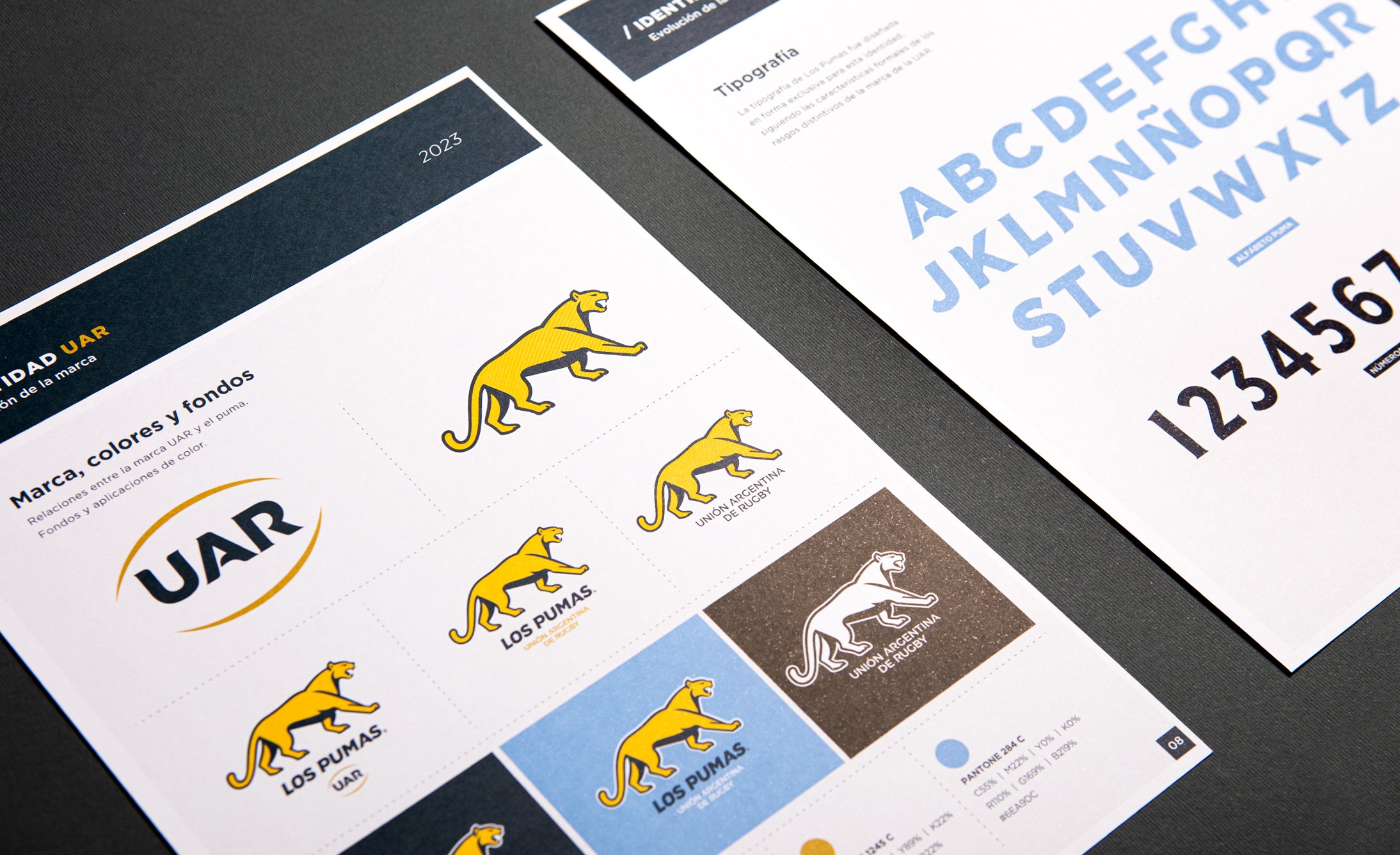

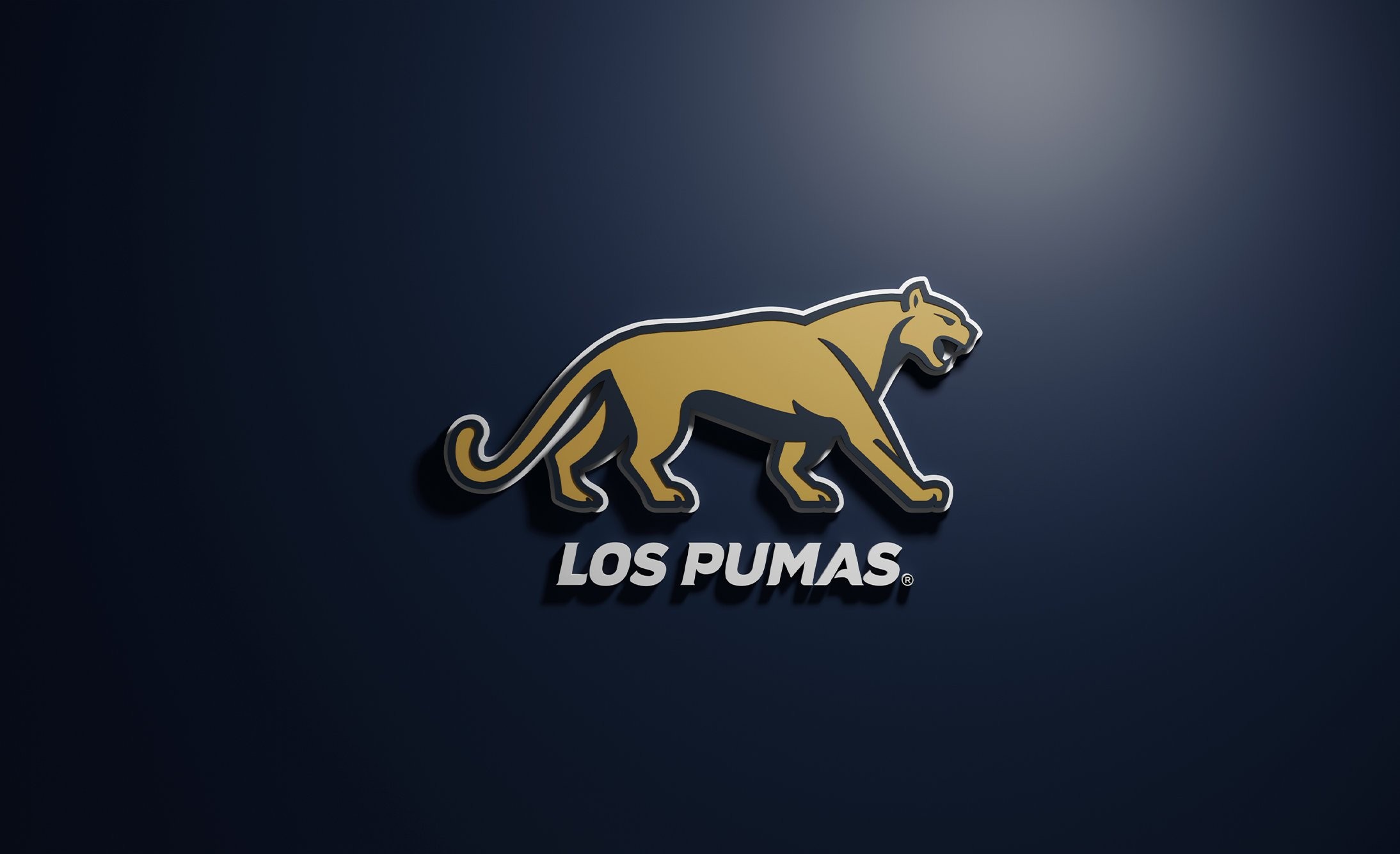
Analyzing the various designs in history, the symbol of the puma, which could be seen on the national team’s jersey in the 1970s, was established as the starting point.

With a renewed design, the new emblem that will now be seen on the national jersey features an authentic and imposing puma with a stronger and more committed character.

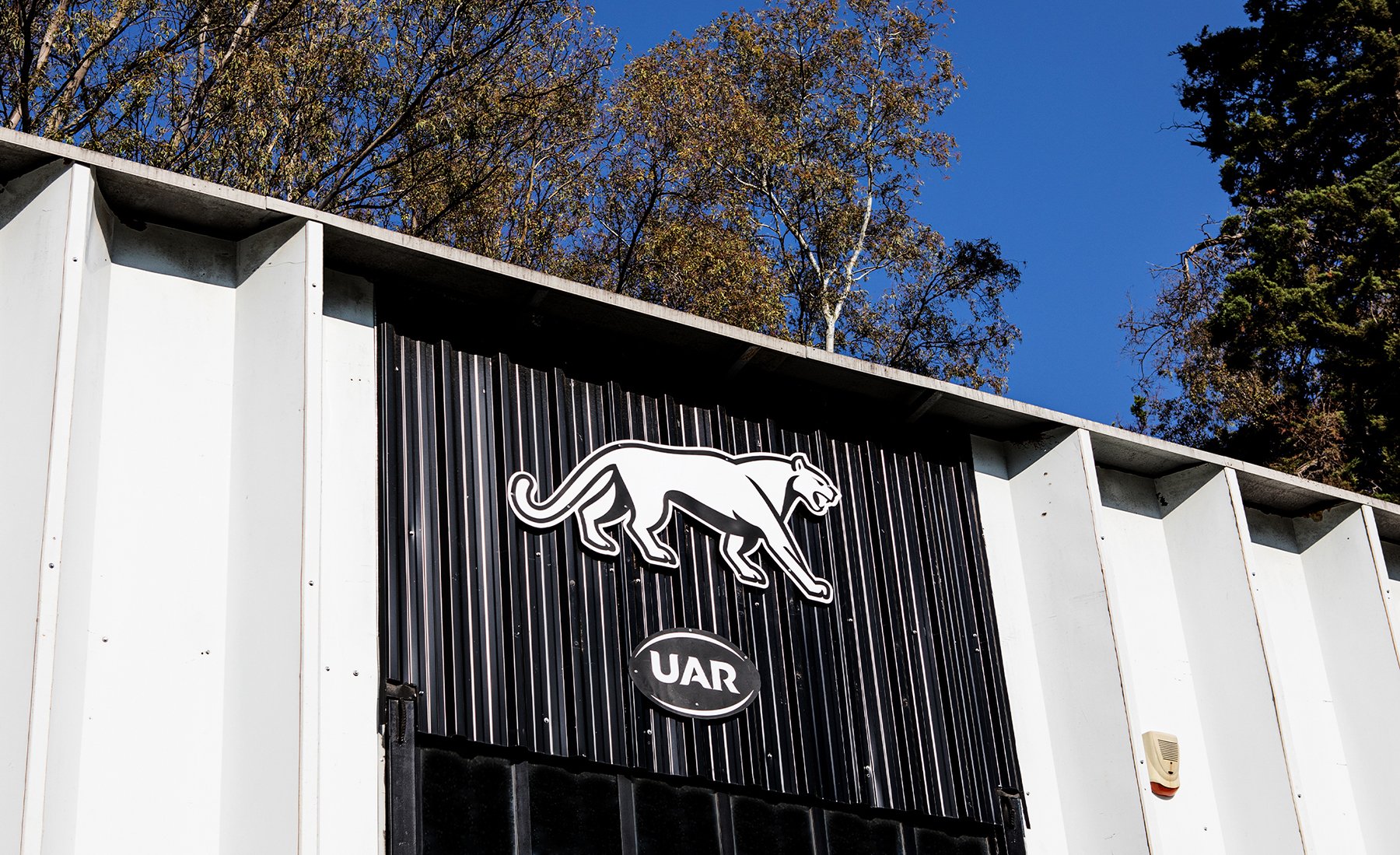


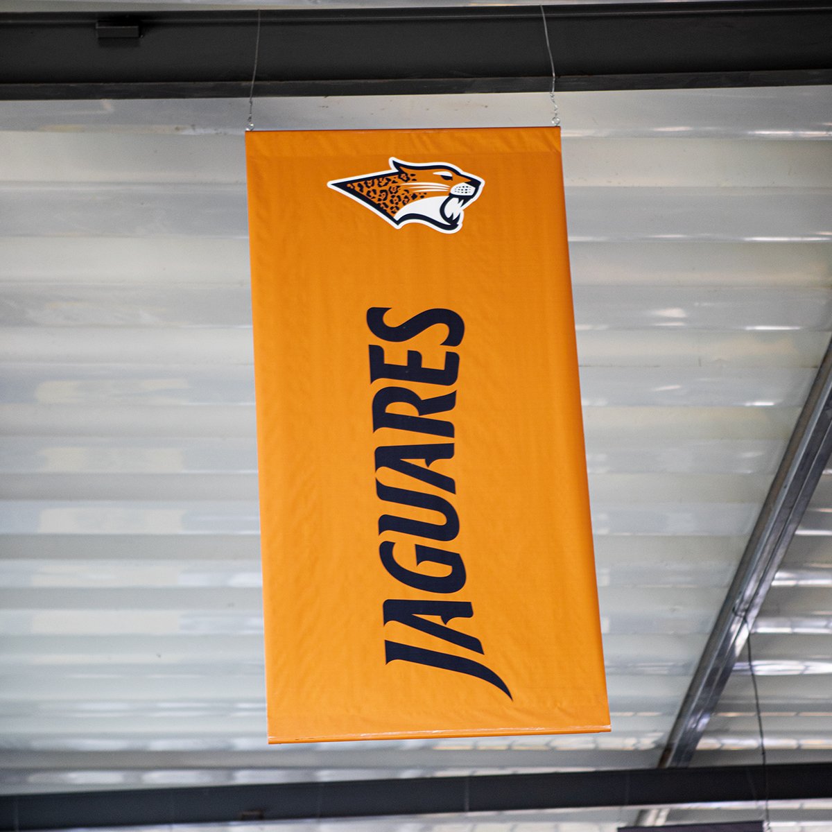


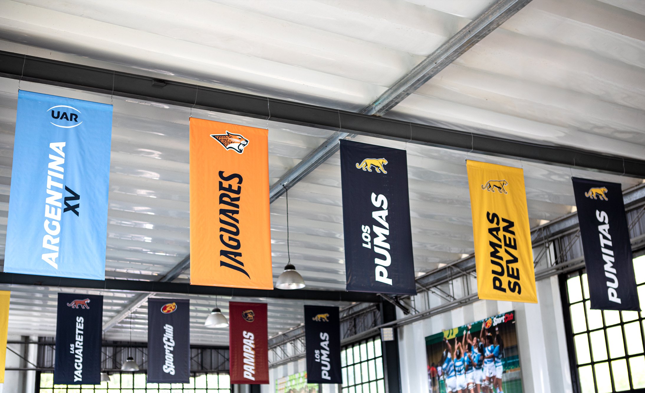
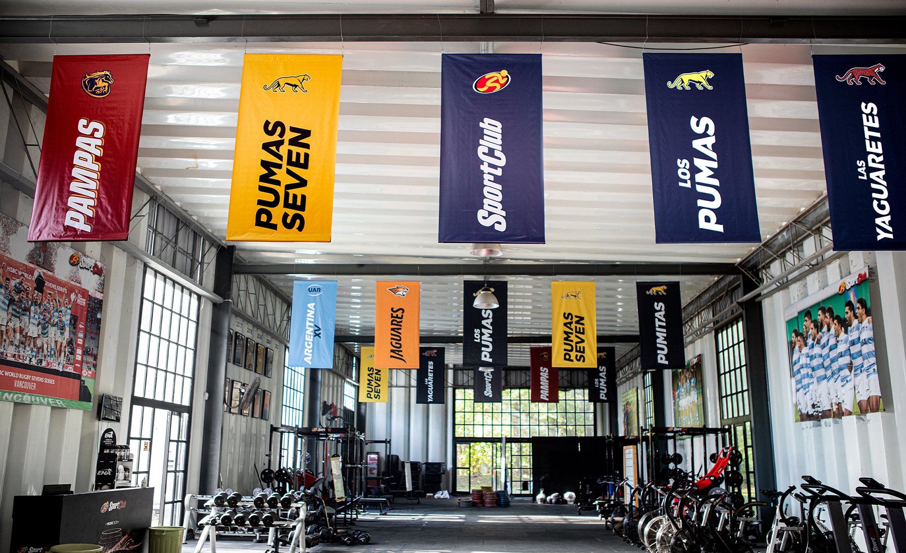


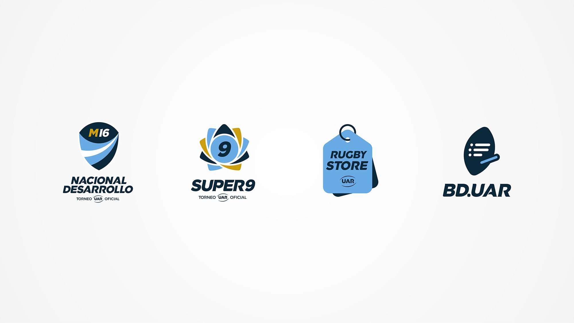
The spirit of the sub-brands emerges from the very essence of the UAR. Based on an exclusive alphabet designed for the new identity of the UAR and Los Pumas, all the sub-brands were developed using the new typography as a foundation. Each sub-brand now has its own personality while still being part of the whole of the UAR.


Contact us
" height="24px" id="Y_SogtFLR" width="23.998702773987908px"/></svg>)
" height="23.91171428571431px" id="eAEKng1cA" width="24px"/></svg>)
" height="24px" id="bloY09y18" width="24px"/></svg>)
" height="15.080483675527217px" id="P2vInqImQ" transform="translate(0 4)" width="23.999999787140037px"/></svg>)
Buenos Aires
Headquarters
Gonzalo Berro
gberro@grupoberro.com
+54 911 4579 5555
Laura García
lgarcia@grupoberro.com
+54 911 6542 4090
Spain
8 Ventura Rodríguez, Portal 6 1A, Boadilla del Monte 28660, Madrid
+34 679 184165
UNITED STATES
9545 Harding Av. Surfside, Florida, FL 33154
2005-2026 @ Berro Group
Contact us
Buenos Aires
Headquarters