Ampersand
Branding & Identity.
Packaging Design.
Client
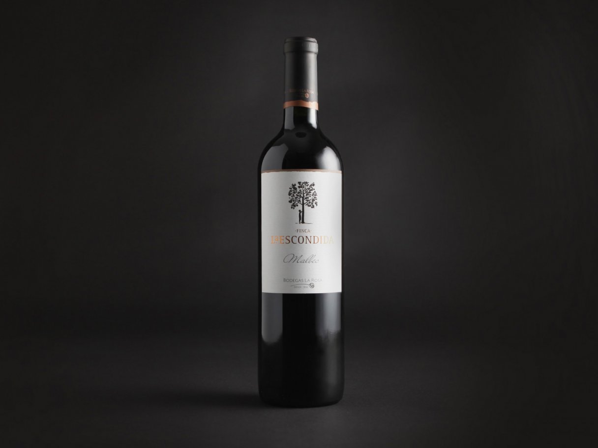
Osborne
Service
Branding & Identity.
Packaging Design.
Year
2013
Abordar un proyecto desde el minuto cero es la mejor manera de potenciar un trabajo de diseño. Osborne, una de las compañías de bebidas más importantes de Europa, nos invitó desde el primer momento a pensar, juntos, en un nuevo lanzamiento.
El desafío
En el año 2013, la estrella del mundo de las bebidas espirituosas en Europa era el gin, o “ginebra”, como le dicen en España. Una categoría de altísima competencia con muchas marcas de renombre y una propuesta muy variada, tanto de sabores como de presentaciones. Osborne, que distribuía una marca importada y veía los grandes volúmenes en ventas, decidió crear y lanzar una nueva marca. Para ello, se desarrollaron diferentes “territorios”, buscando el perfil ideal para establecer una marca distinta, original y con carácter.
La oportunidad
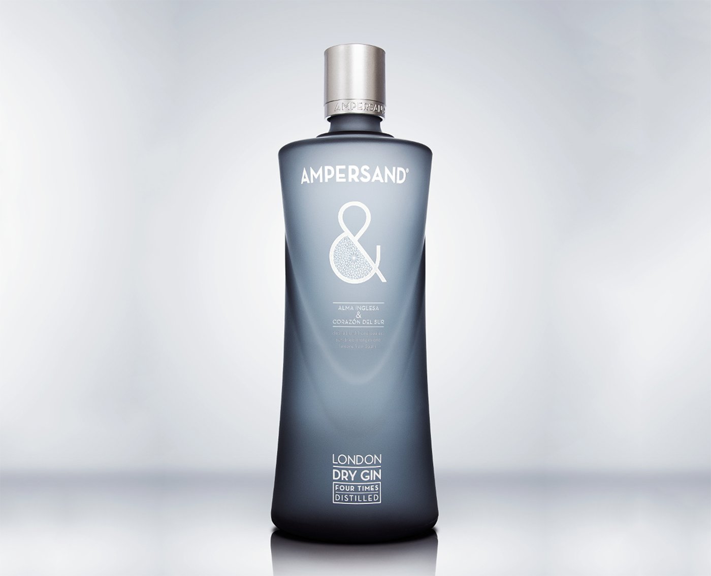
Habiendo analizado bien la categoría, y teniendo presente la competencia, se decidió combinar el sabor inglés del gin con la calidez española. ¿Podríamos volcar dos identidades tan acentuadas en un mismo envase? La marca elegida fue Ampersand. Y con esa dualidad del mix de lo anglosajón con lo latino, diseñamos una botella “doble”, que de frente tuviera un perfil, y de costado otro, generando, además de un objeto innovador, la idea de conjunto, de suma de las partes.
El resultado
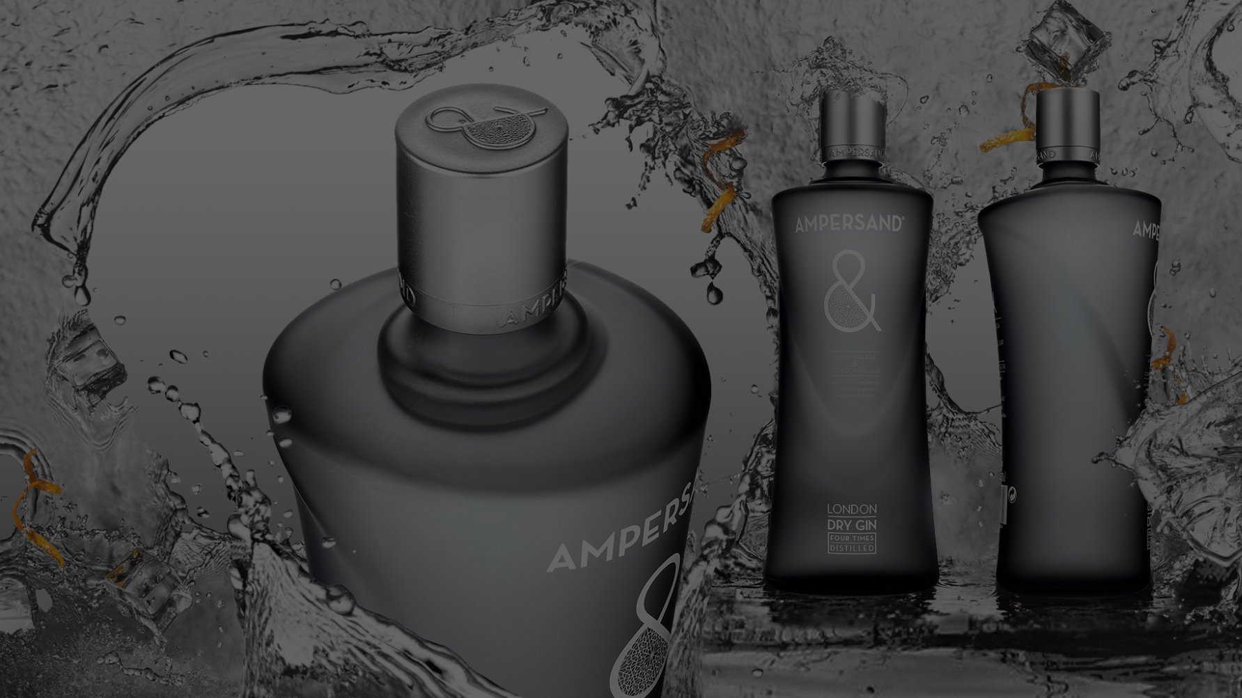
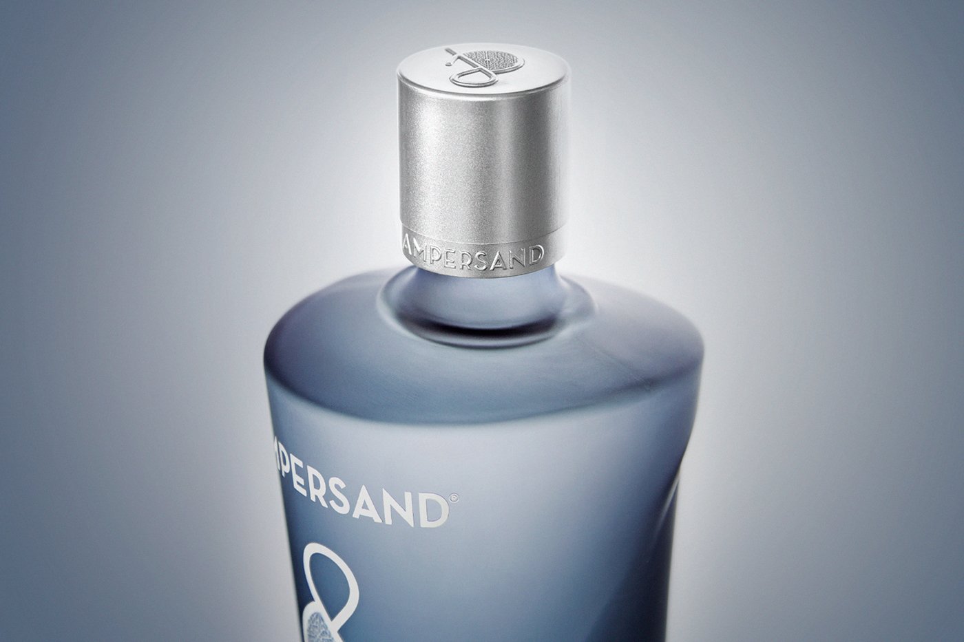
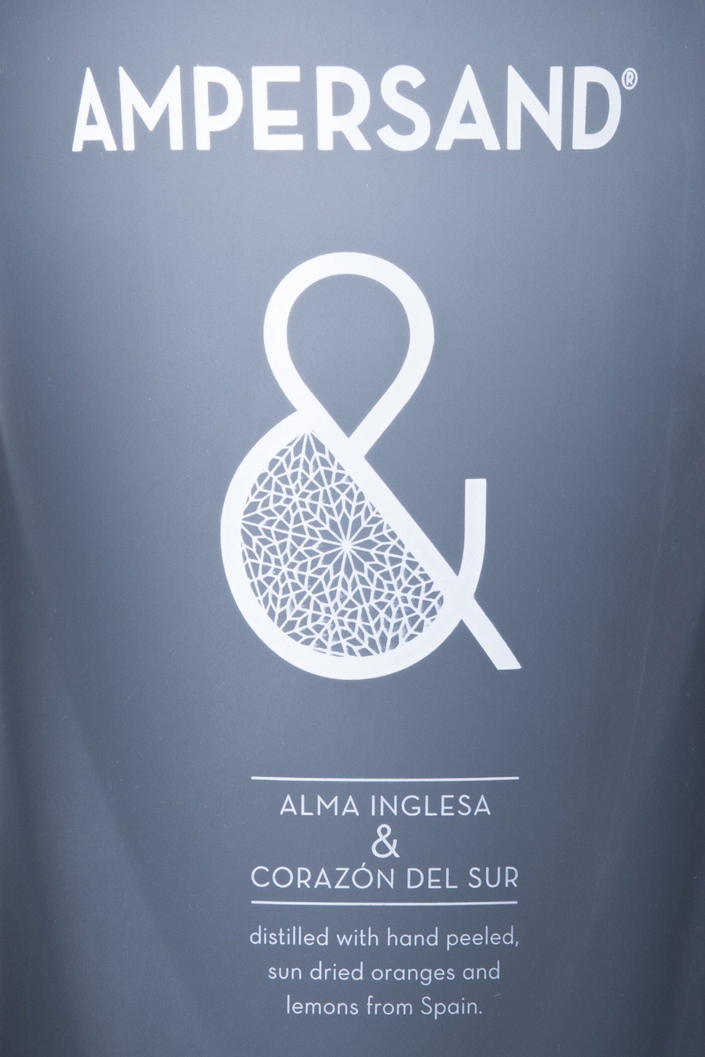
La esencia de Ampersand se ve en el icono “&”, que sintetiza esta fusión entre el sabor inglés y la elaboración española. El packaging es bilingüe: habla de “alma inglesa & corazón del sur”, para después aclarar, en inglés, que es un producto destilado con naranjas peladas a mano. Hoy Ampersand se ubica entre las principales marcas de gin del mundo, destacándose por su elegancia y distinción.
Abordar un proyecto desde el minuto cero es la mejor manera de potenciar un trabajo de diseño. Osborne, una de las compañías de bebidas más importantes de Europa, nos invitó desde el primer momento a pensar, juntos, en un nuevo lanzamiento.
El desafío
En el año 2013, la estrella del mundo de las bebidas espirituosas en Europa era el gin, o “ginebra”, como le dicen en España. Una categoría de altísima competencia con muchas marcas de renombre y una propuesta muy variada, tanto de sabores como de presentaciones. Osborne, que distribuía una marca importada y veía los grandes volúmenes en ventas, decidió crear y lanzar una nueva marca. Para ello, se desarrollaron diferentes “territorios”, buscando el perfil ideal para establecer una marca distinta, original y con carácter.
La oportunidad
Habiendo analizado bien la categoría, y teniendo presente la competencia, se decidió combinar el sabor inglés del gin con la calidez española. ¿Podríamos volcar dos identidades tan acentuadas en un mismo envase? La marca elegida fue Ampersand. Y con esa dualidad del mix de lo anglosajón con lo latino, diseñamos una botella “doble”, que de frente tuviera un perfil, y de costado otro, generando, además de un objeto innovador, la idea de conjunto, de suma de las partes.
El resultado
La esencia de Ampersand se ve en el icono “&”, que sintetiza esta fusión entre el sabor inglés y la elaboración española. El packaging es bilingüe: habla de “alma inglesa & corazón del sur”, para después aclarar, en inglés, que es un producto destilado con naranjas peladas a mano. Hoy Ampersand se ubica entre las principales marcas de gin del mundo, destacándose por su elegancia y distinción.

Contact us
" height="24px" id="Y_SogtFLR" width="23.998702773987908px"/></svg>)
" height="23.91171428571431px" id="eAEKng1cA" width="24px"/></svg>)
" height="24px" id="bloY09y18" width="24px"/></svg>)
" height="15.080483675527217px" id="P2vInqImQ" transform="translate(0 4)" width="23.999999787140037px"/></svg>)
Buenos Aires
Headquarters
Gonzalo Berro
gberro@grupoberro.com
+54 911 4579 5555
Laura García
lgarcia@grupoberro.com
+54 911 6542 4090
2005-2026 @ Berro Group
Contact us
Buenos Aires
Headquarters
Gonzalo Berro
gberro@grupoberro.com
+54 911 4579 5555
Laura García
lgarcia@grupoberro.com
+54 911 6542 4090
2005-2026 @ Berro Group
Contact us
Buenos Aires
Headquarters